
Project overview
The multi-stage revamp of the entire VanPeople classified listing home rental's mobile experience was a "cornerstone product enhancement" initiative spanning approximately a year and a half.
Ultimately, the project has resulted in the platform attracting more daily visitors, featuring more trustworthy rental listings, receiving a higher volume of property listings on a daily basis, and generating additional revenue from a group of users that were previously overlooked.

Project background
A once-thriving marketplace was experiencing a rapid decline
Ten years after its launch, VanPeople's classified listing platform has thrived, thanks to the massive influx of Chinese international students coming to study in Canada. It has become the most well-known platform for Chinese residents in British Columbia to find home rentals.
However, as the user base has grown younger, VPP's outdated design, lack of modern filtering features, and the abundance of low-credibility rental listings have made it difficult to attract new users.
Background problem
More people have started to search for rental properties elsewhere
By comparing the data collected from December 2019 to June 2020 with that of December 2018 to June 2019, we noticed troubling drops in some key metrics for the home rental section.
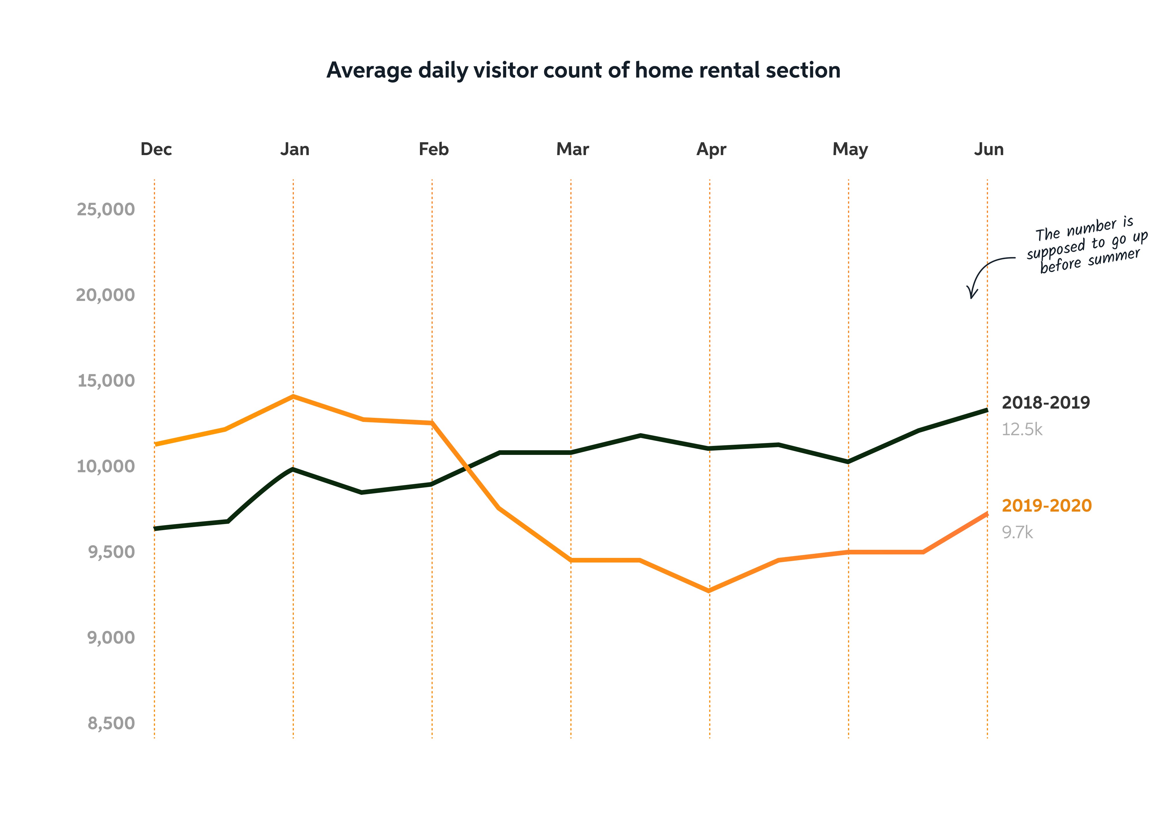
The home rental section's average daily visit count fell from 12.5k down to 9.7k
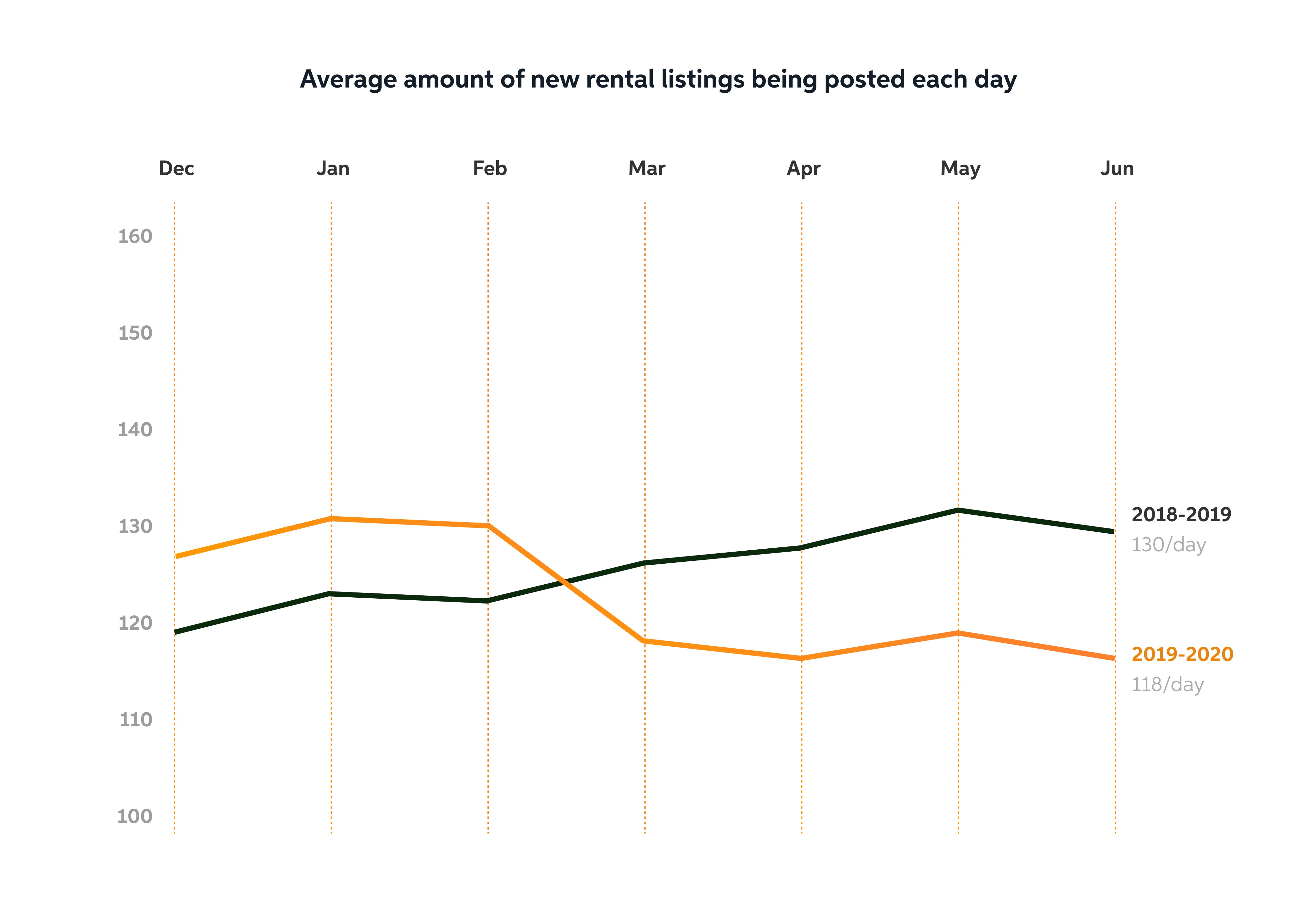
The average amount of new rental listings being posted each day went from 13 down to 118.
Research
Find out more on why the numbers were dropping left and right
To gain insight into why the platform was losing popularity, we initiated a comprehensive research effort, comprising surveys, 1 on 1 interviews, user journey mapping and market competitor analysis.
Survey
Get in touch with our users and recruit potential participants for future research
We began the research by conducting a round of qualitative research using Tencent Questionnaire during Dec 2020.
Due to the notable resource investment required and the fact that many of our users actively used multiple sections across the VanPeople classified listing, only a portion of the survey questions were dedicated to collecting user feedback on the home rental section's user experience.
Qualitative research
Understand user pain points better by doing 1:1 interviews
In early 2021, over a two-week period, we conducted interviews by inviting 20 participants from the pool of willing volunteers we had gathered through the earlier survey.

Notable findings
Significant issues were identified regarding listing credibility, search efficiency, and the property listing user flow

Major trust issue
17/20 of the participants complained that many rental listings did not seem that credible.

Difficult to use
16/20 of the participants reported that looking for homes was taking too much effort as there were no ways for users to narrow down their options.

No incentive to contribute
4/5 of the participants who have posted ads before reported that they do not really feel like adding detailed rental info when they list properties on our platform.
While the findings were fairly consistent with the results of the survey we conducted earlier, surprisingly, the number of people who complained about our search function was much lower than what we have expected.
User journey mapping
Conduct a walkthrough of a typical rental home search journey to identify all areas of opportunity and visualize all the pain points
Market competitor research
Market competitor research
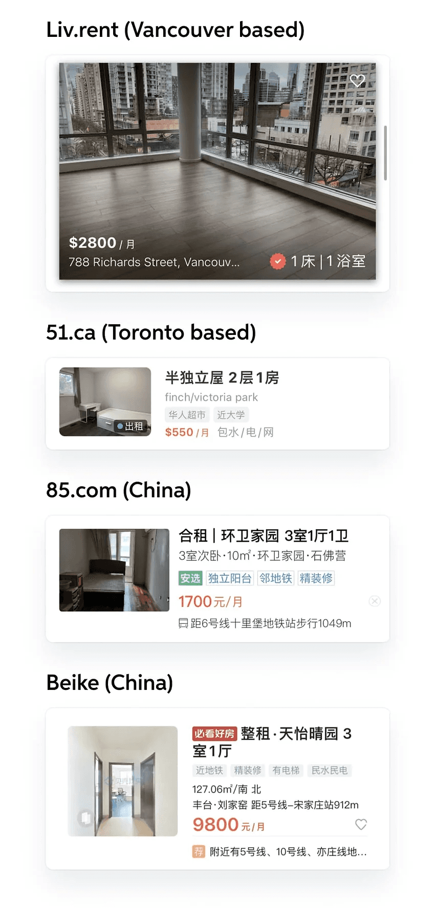
To better understand our position in the market, my team compared VPP's rental section to other popular platforms used by our users.
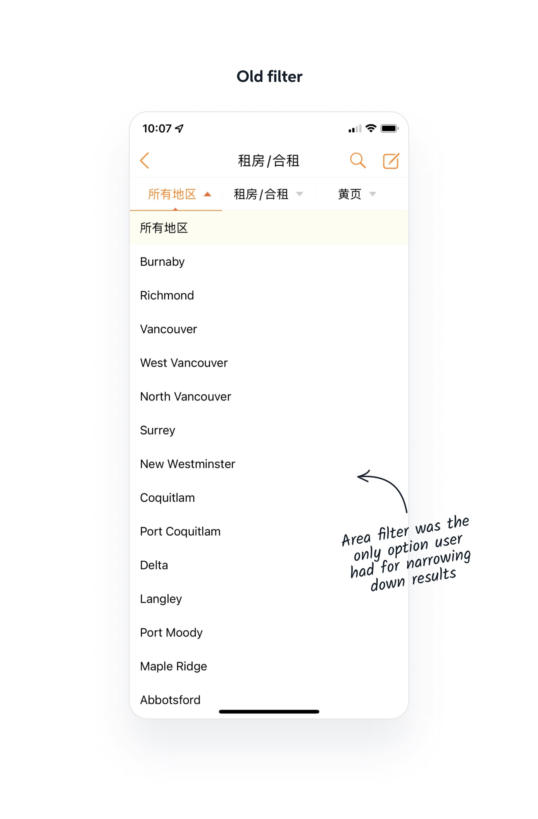
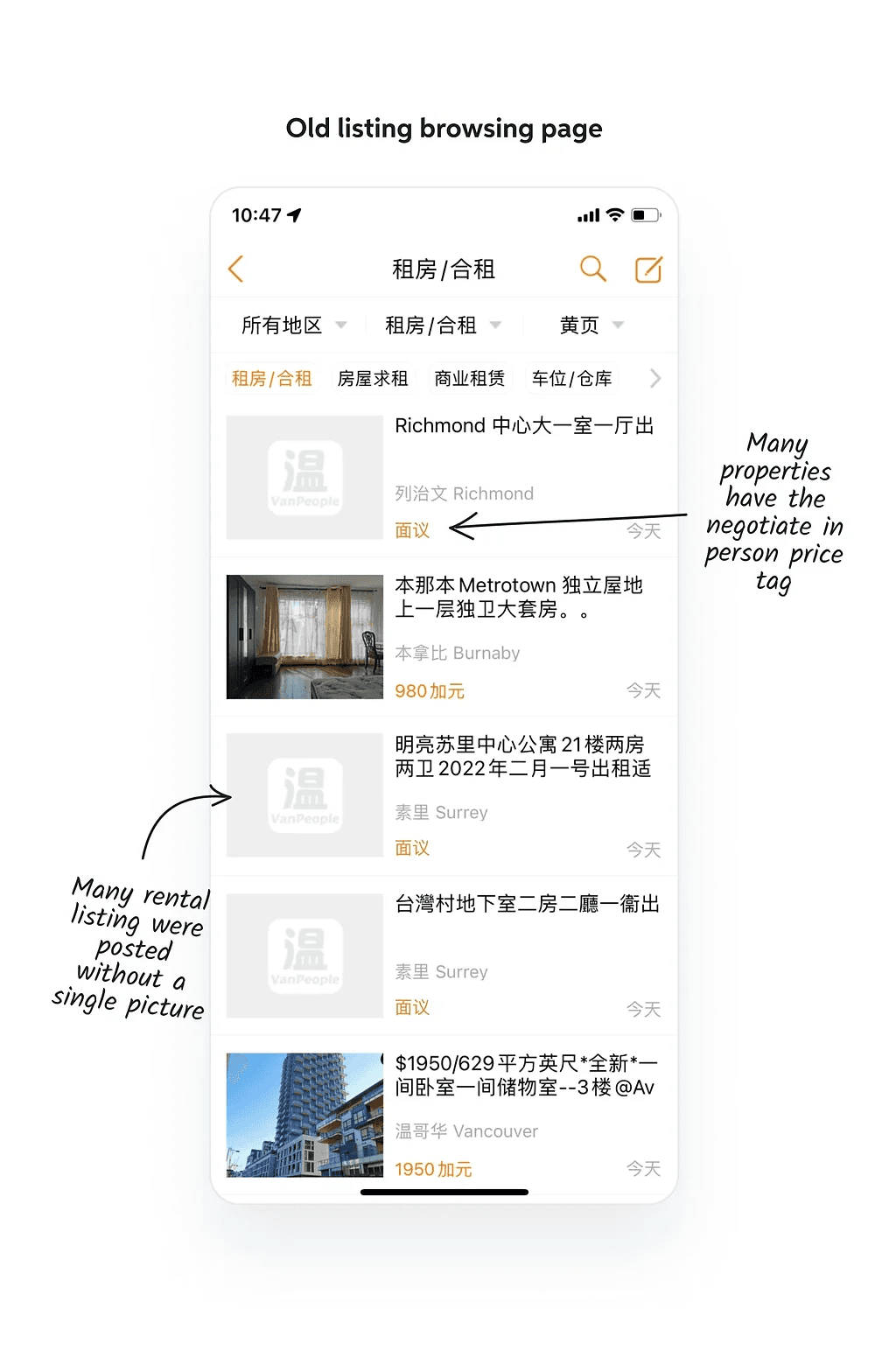
With VanPeople, users can list their property for rent
Without the need for an account.
By only providing a short ad title such as '[room for rent]' with a brief 20-character description.
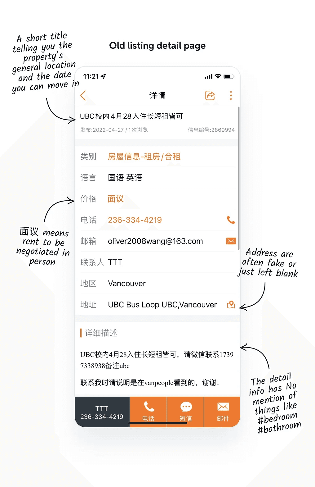
Without providing any photos, an address, or specify the number of bedrooms or bathrooms.
However, this ease of posting has resulted in VanPeople having the lowest listing credibility.
Connecting the dots
How were all the issues we found connected to each other?
After going over the findings we gathered during the research stage, my team has arrived at the following conclusion:

Inconvenient property listing workflow

Inability to include any meaningful property filter
More listings including less information
An endless downward spiral for the platform
Goals & constraints
After connecting the dots and reviewing all the problems discovered during the research phase, my team has established the following overarching goal for this project.

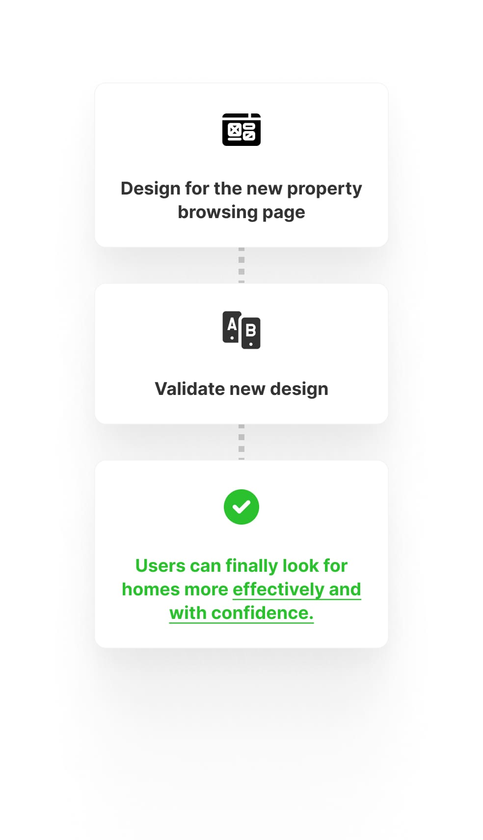
How might we implement changes to help Chinese home renters search for homes more effectively and with more confidence?
Notable constraints
While brainstorming ideas on how to achieve the project goal, we became aware of two constraints that will limit the extent of what we can accomplish with this revamp project.
01
Unable to efficiently implement progressive UI changes due to existing users' attachment to the current setup
Although attracting younger users was a primary strategy for expanding the platform's user base, we had to consider that the majority of VanPeople users were older individuals who were less adaptable to changes and had become accustomed to the platform's consistent appearance over the past four years.
Thus, drastically changing the look and feel of everything all at once was deemed too risky, as it might create too much disruption to the current user experience.
02
Cannot meaningfully improve the search experience due to having an outdated back-end framework
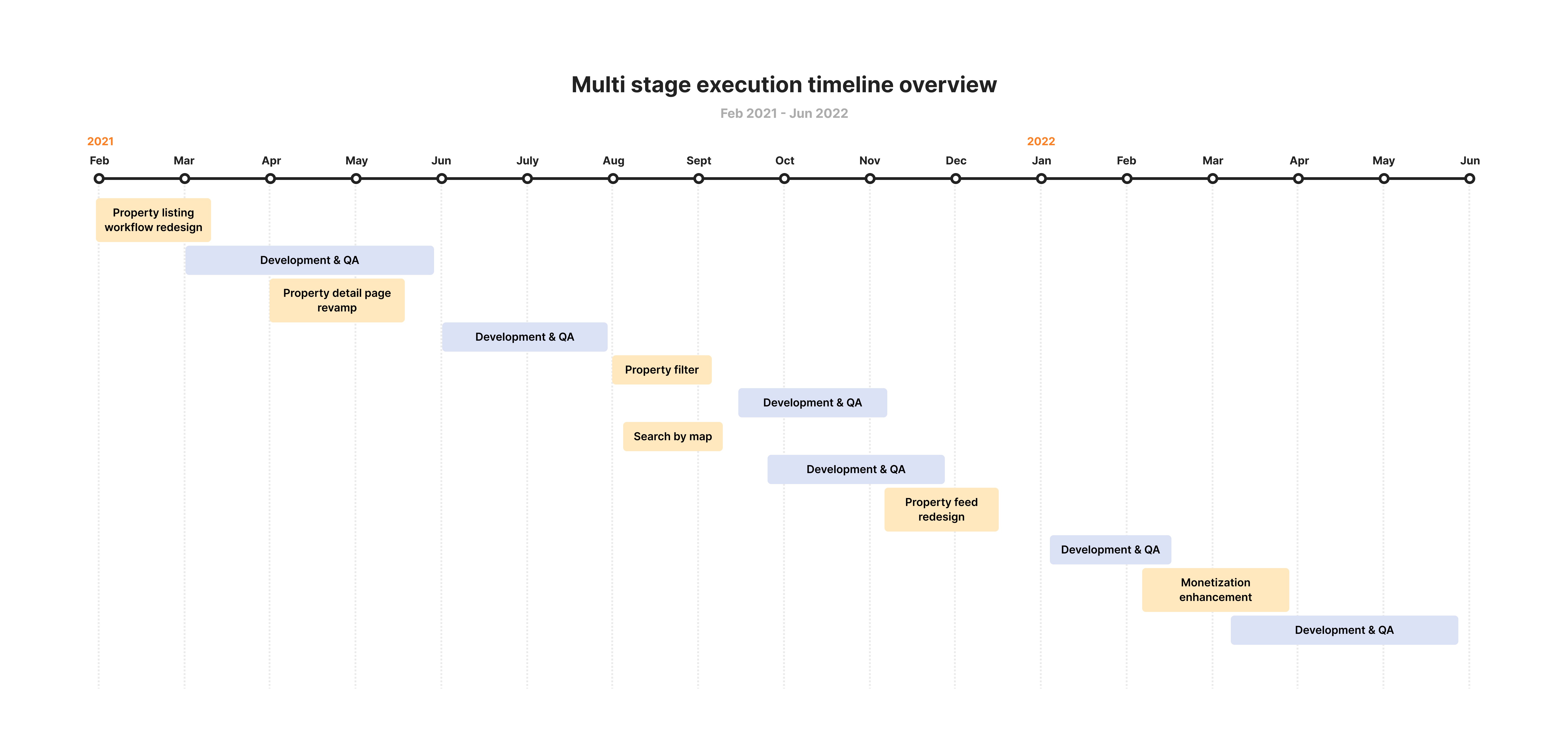
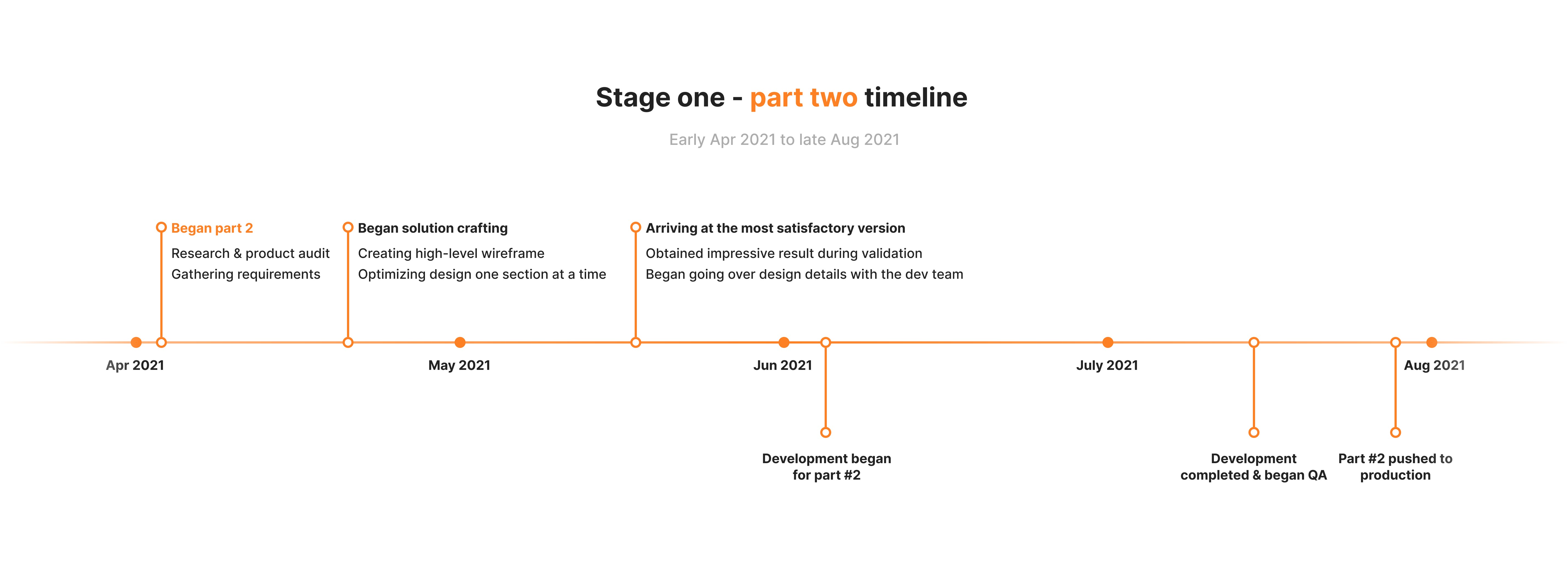
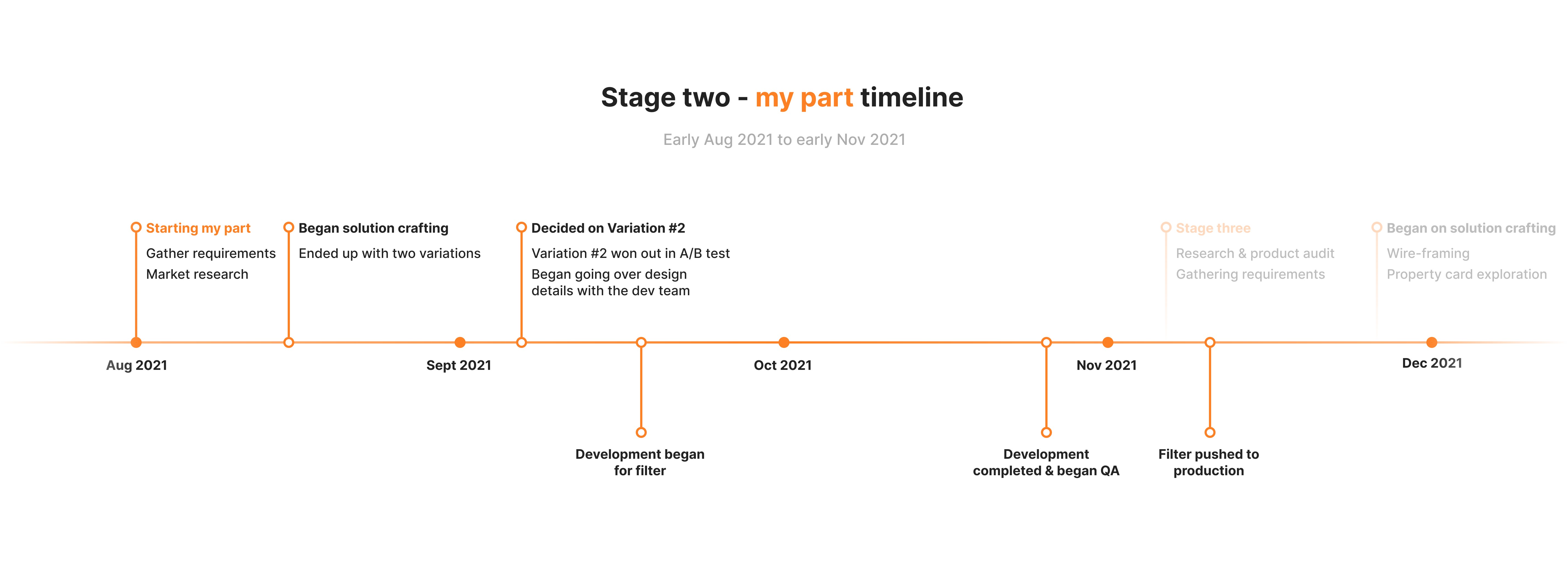
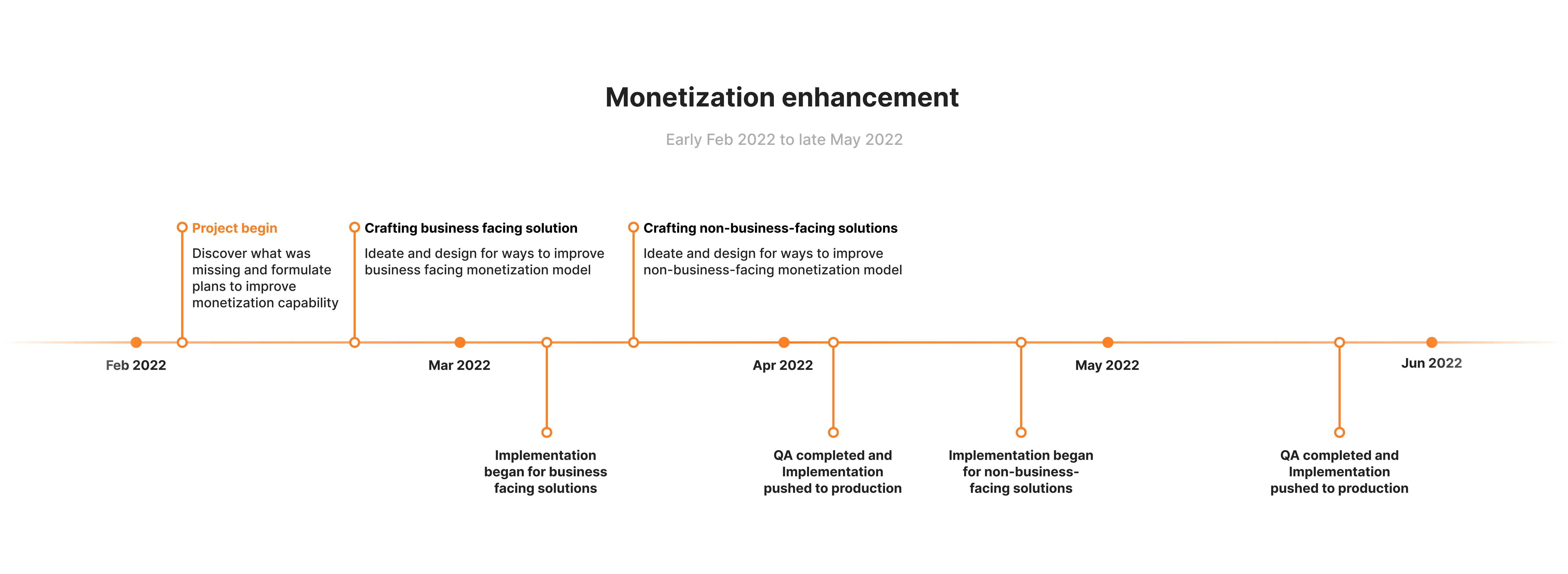
Multi-stage rollout plan
Stage One
Stage Two

Stage Three
Setting a better design foundation

Rebuild trust - Part one
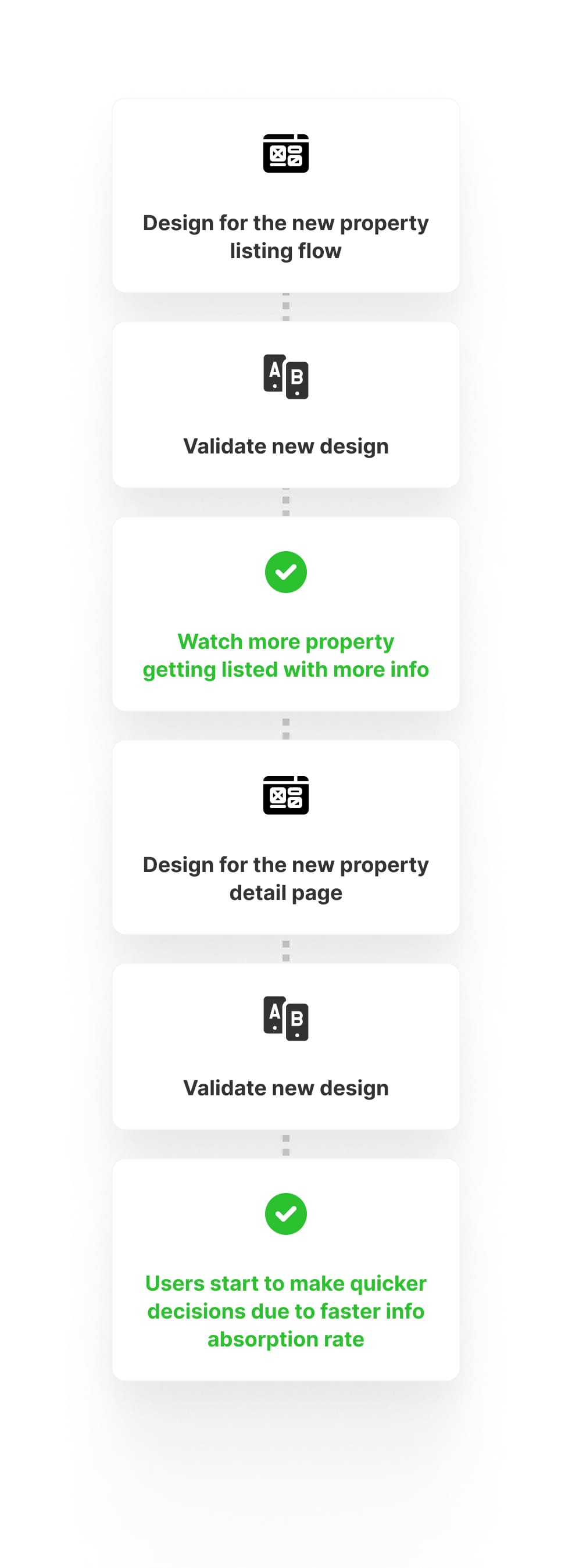
Revamp the property listing flow
The redesign of the property listing flow had two goals. Firstly, the project aimed to reduce the time users spend filling out the content of a property listing ad. Secondly, it aimed to encourage users to provide more detailed information in the future when using the new flow.
Gather design requirements & creating an wireframe
I created a basic wireframe based on the design requirements gathered through research.
Introduce new interactive components to improve workflow efficiency
Arrive at Version 1.0 - An improved one-page design basing off of the old design
Due to time constraints, I opted for a straightforward one-page design, essentially an extended version of the previous layout.
Come up with an alternative multipage approach
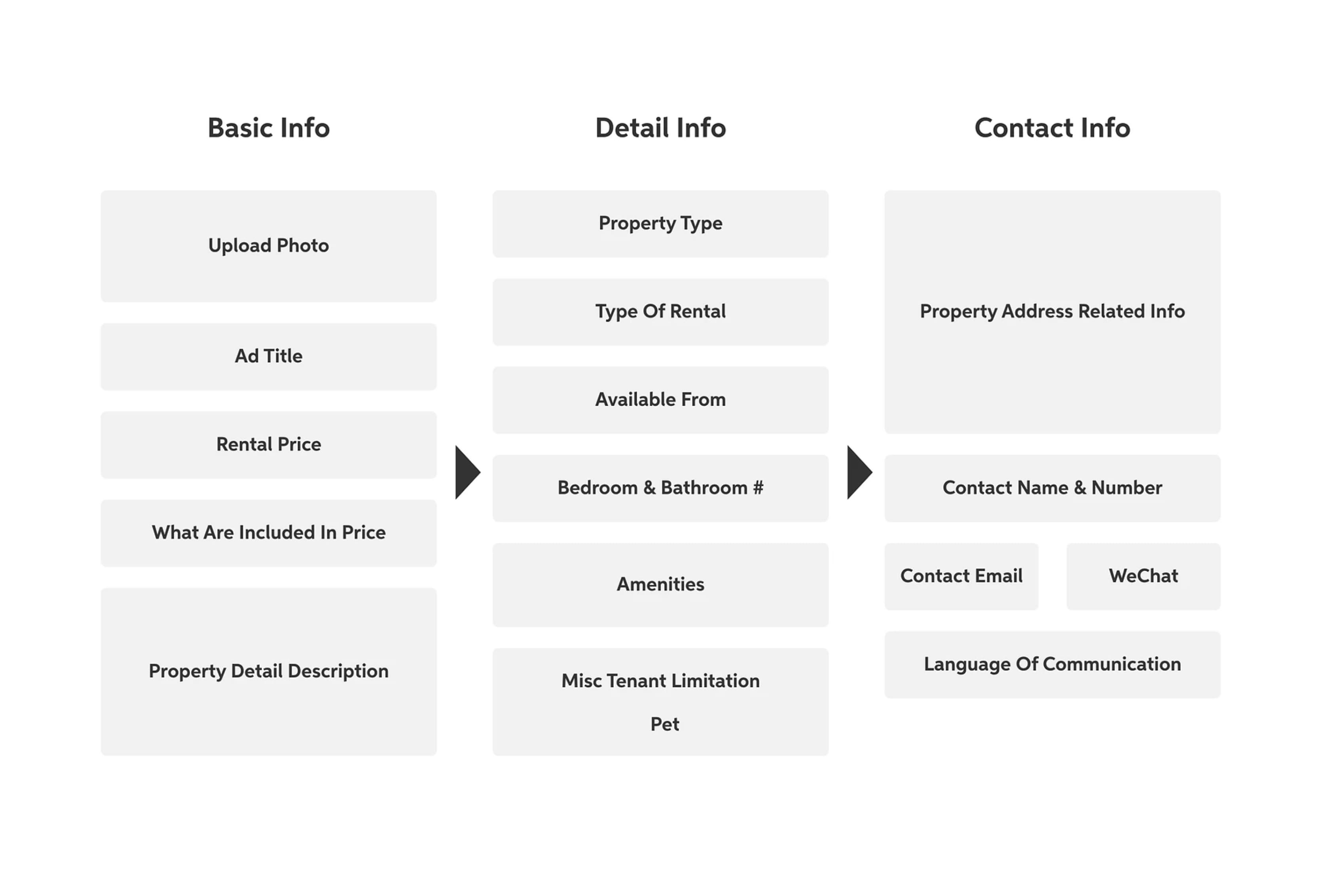
Version 2 / Final version
Following thorough exploration, I decided on the hi-fi version presented below. I also conducted a validation test with my co-workers to verify that this new approach was more effective at conveying information than the initial version.
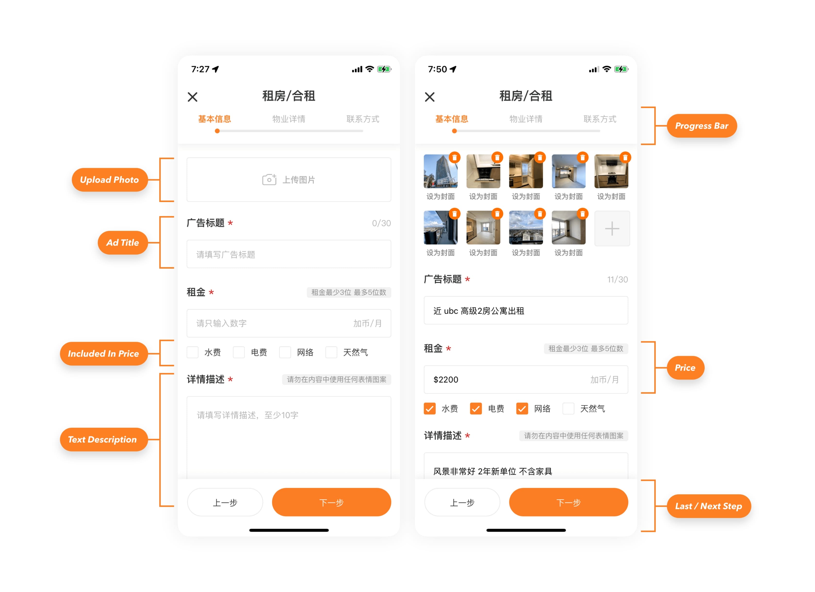
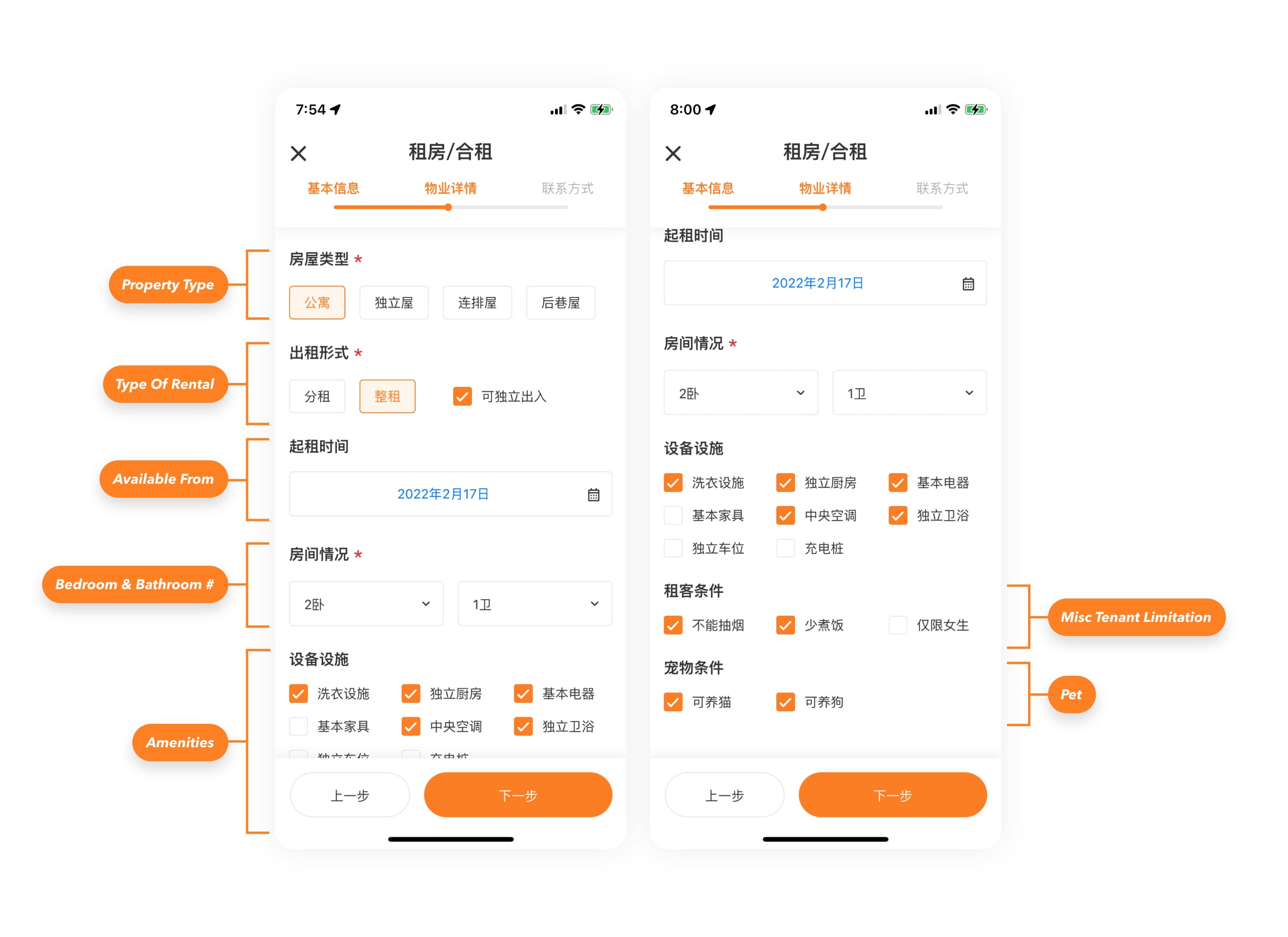
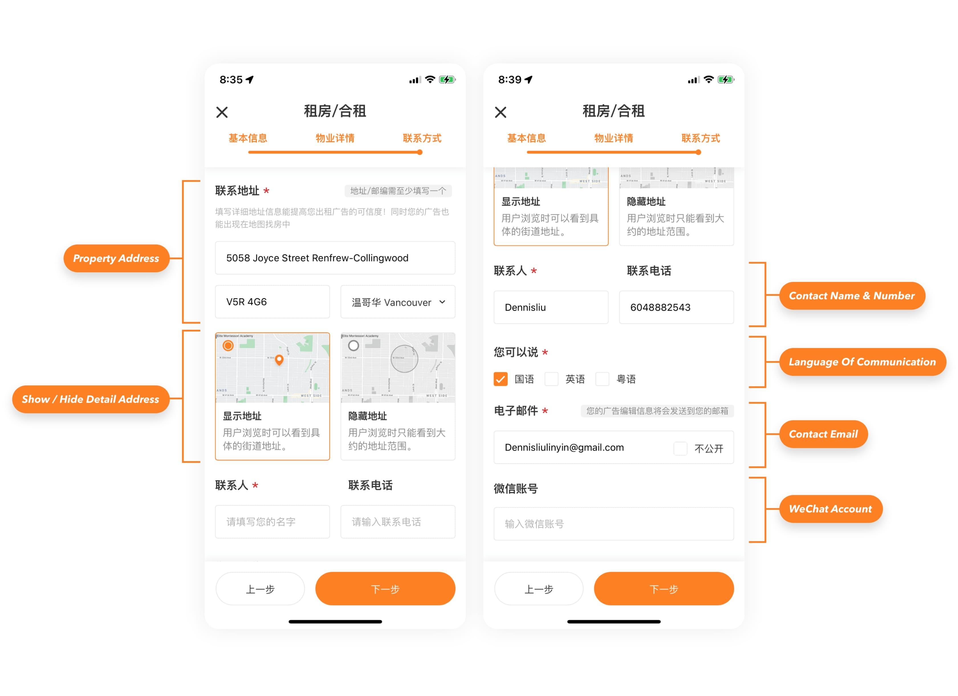
New listing flow in action
Post implementation design validation
After the new property listing workflow went live on our beta testing server, I conducted a final round of A/B testing with some of my co-workers.

Avg. property listing time
-5 mins / 3X faster
From 7 mins to 2 mins
Users were able to list a new property with good amount of detail information about 3X faster with the new 3-step process.
Redesign the property detail page
The aim of redesigning the property detail page is to facilitate users in quickly reviewing a property's details, thereby reducing the time needed to decide whether to contact the landlord to rent the place or explore other options.
Begin with competitor research
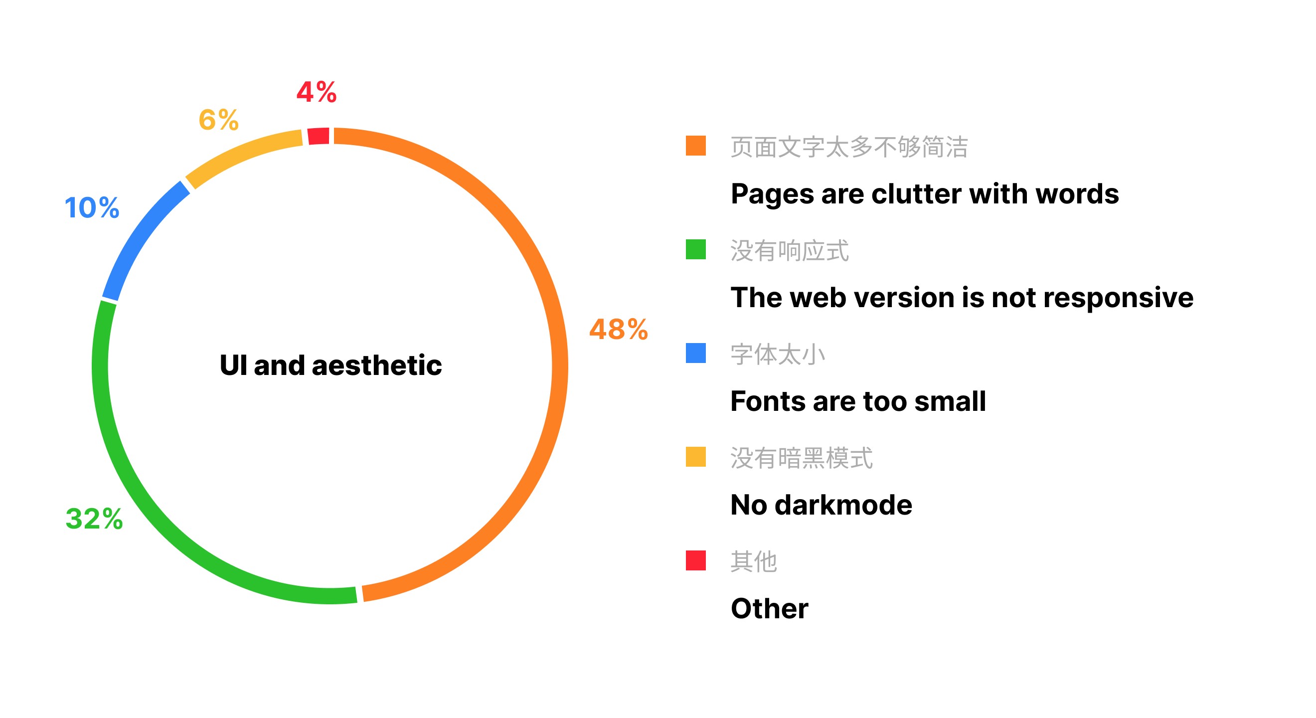
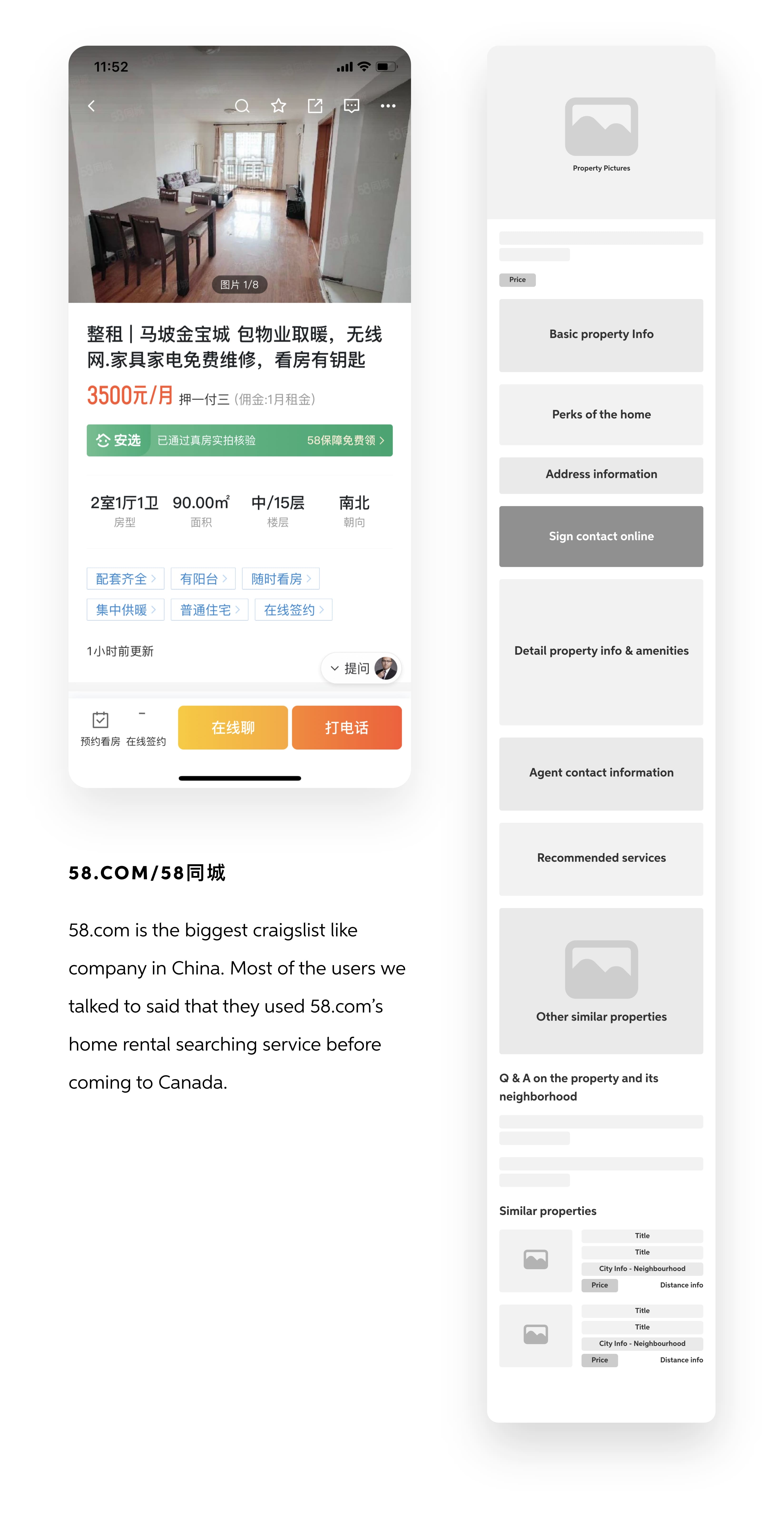
To improve the existing design, I sought inspiration by examining how other major players, such as 51.ca in Toronto and 58.com in mainland China, were designing their property detail pages.

Audit the usability of the Old property detail page
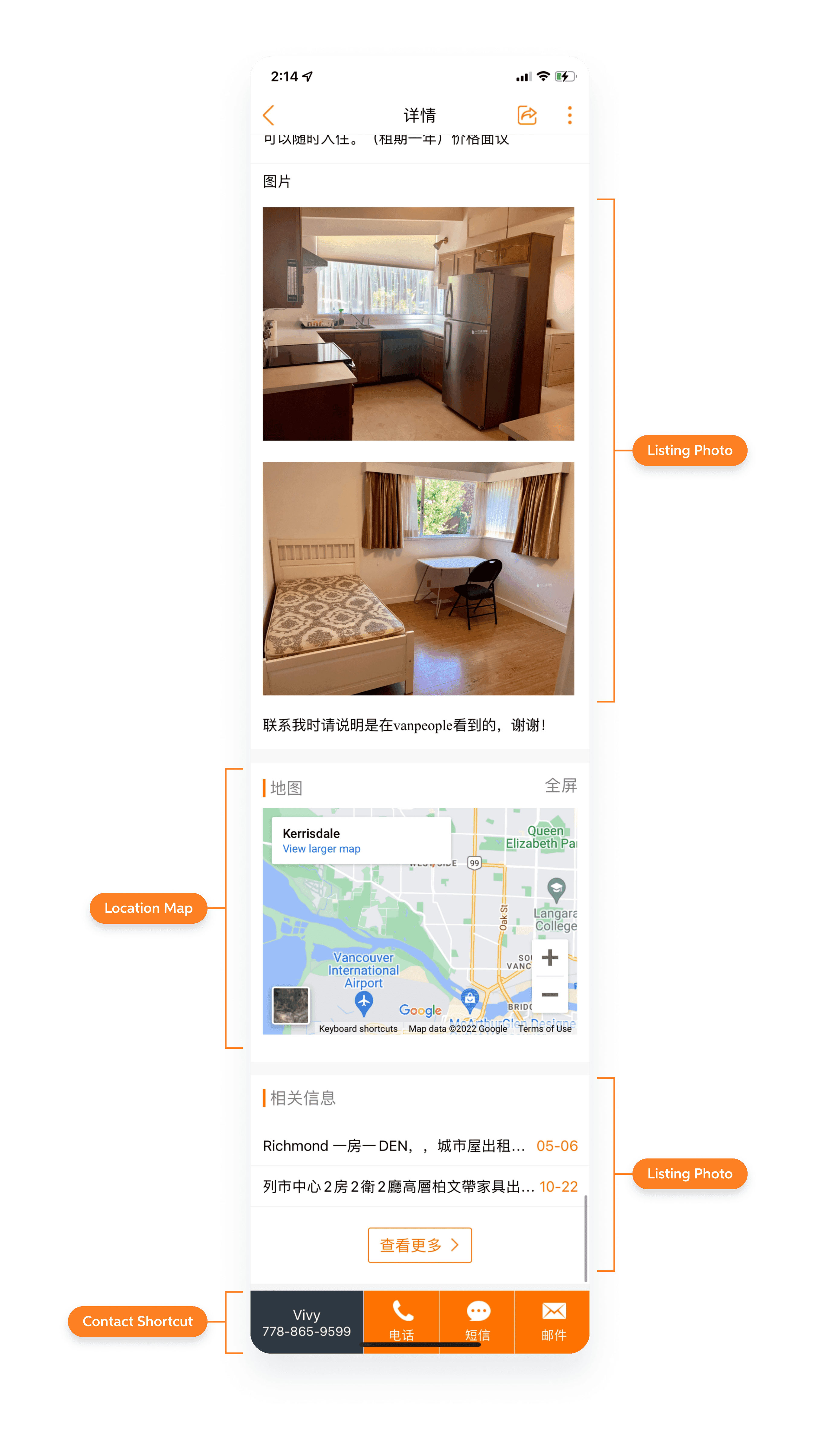
After reviewing the designs of other major players in the market, I compared our old listing detail page to theirs and compiled a list of items where we can make improvements.

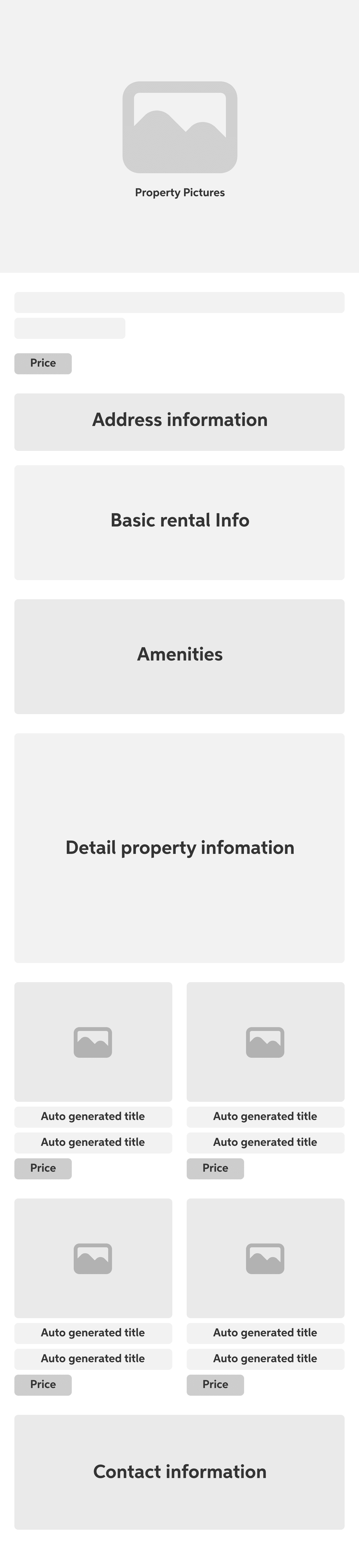
Create a high-level information hierarchy for the new detail page
Based on the designs of other major players in the market, I reorganized the information hierarchy for the various sections on our current page. Additionally, I introduced some new sections to address the issues identified during the audit I conducted earlier.
The newly revamped listing detail
I progressed through the hi-fi design, refining one section at a time. I continuously optimized the design based on feedback from other designers and stakeholders in the company.
After nearly two weeks of iterating through various versions with minor differences, I settled on a final version of the page. I believe this version achieves the goal of being a more informative page with a modern, clean design that enables users to glance through property information more quickly than before.
Design validation
Avg. decision making time
-23 sec / 73% faster
From ~50 seconds to ~28 seconds
When comparing the speed of decision-making between the new and old designs, participants were able to decide whether to contact the landlord much quicker when viewing the same property on the newly designed property detail page.
Improved informativeness and monetization potential of users' initial scroll
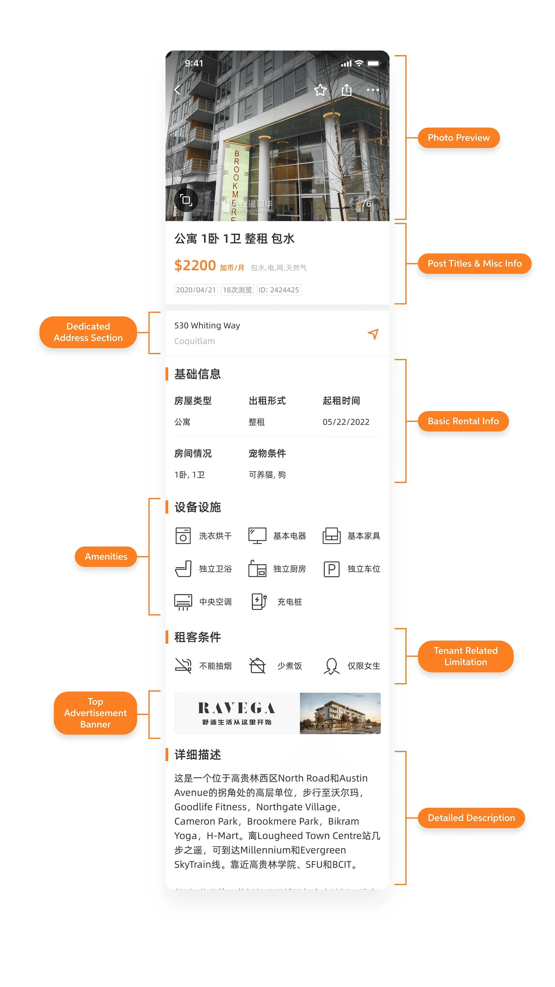
All key info at a quick glance

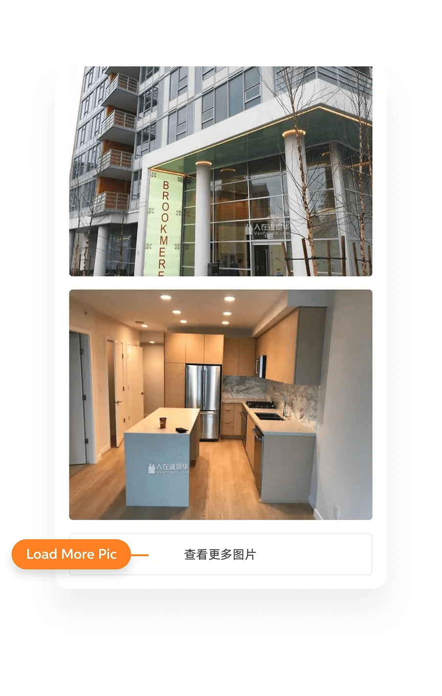
A more intuitive enlarged photo-viewing experience
Added a proper close/back button at the top right of the screen and also added a scrollable small photo preview section at the bottom of the screen.
A new "load more" button allowing users to view more listing photos only when they feel like it
Users are no longer forced to scroll past 10+ photos each time they want to view content located at the bottom of the detail page.
A more useful recommendation section and better utilization of end-of-page traffic

A renewed shortcut bar
The newly designed contact method shortcut bar will dynamically presents available contact options appearance based on the different types of contact methods added. Users will no longer get error messages when interacting with this new version.

New property detail page in action
Notable improvement in both listing quality and quantity
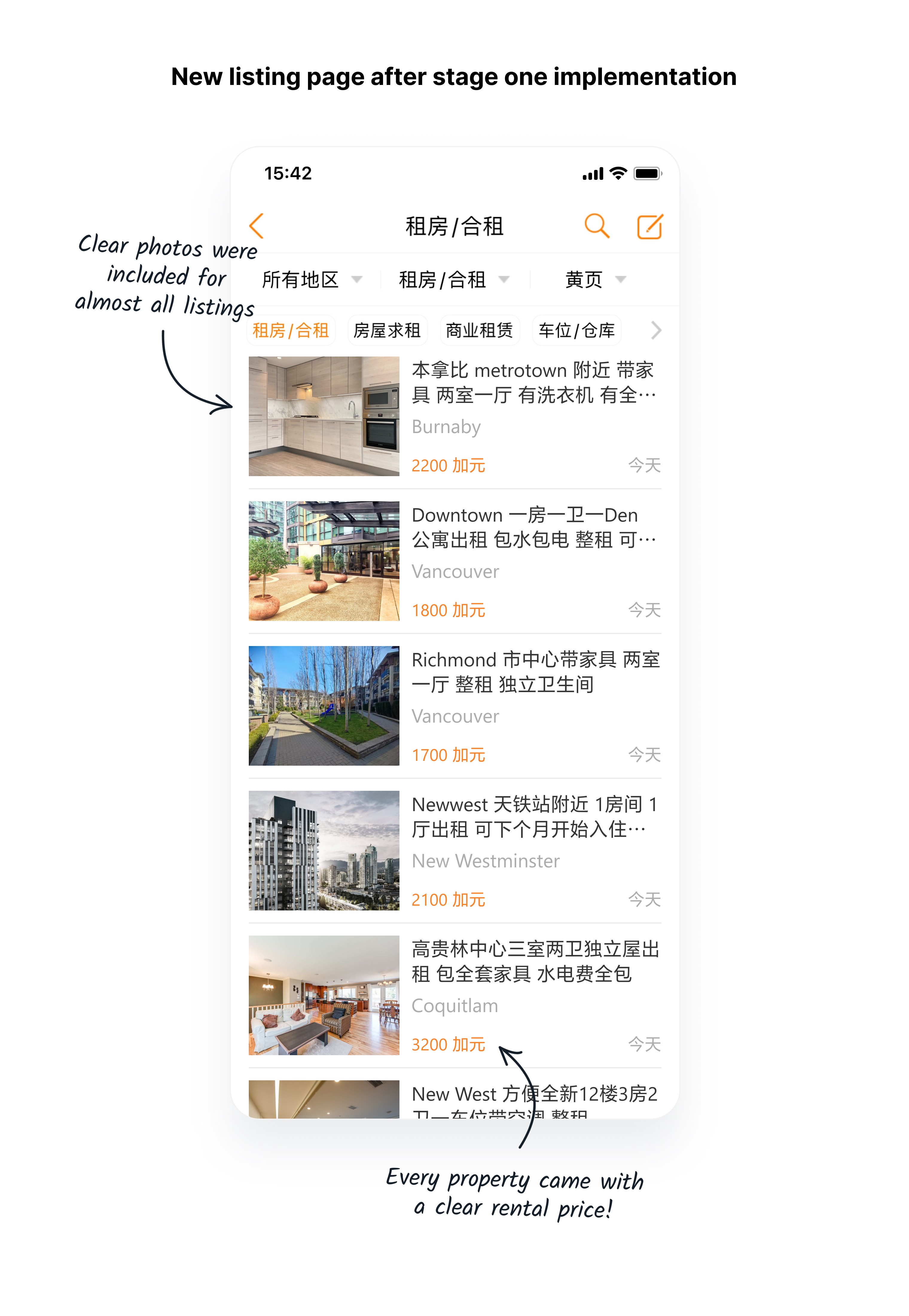
Two months after rolling out the new property listing flow and updated detail page, we've observed a positive trend: an increase in the average number of daily rental listings. This suggested that more homeowners were now seeing VanPeople as an effective platform to attract renters. Significantly, these listings now feature much more detailed information.
The best part was that the decline in daily visitor numbers has stopped, and we are optimistic about seeing an increase soon.
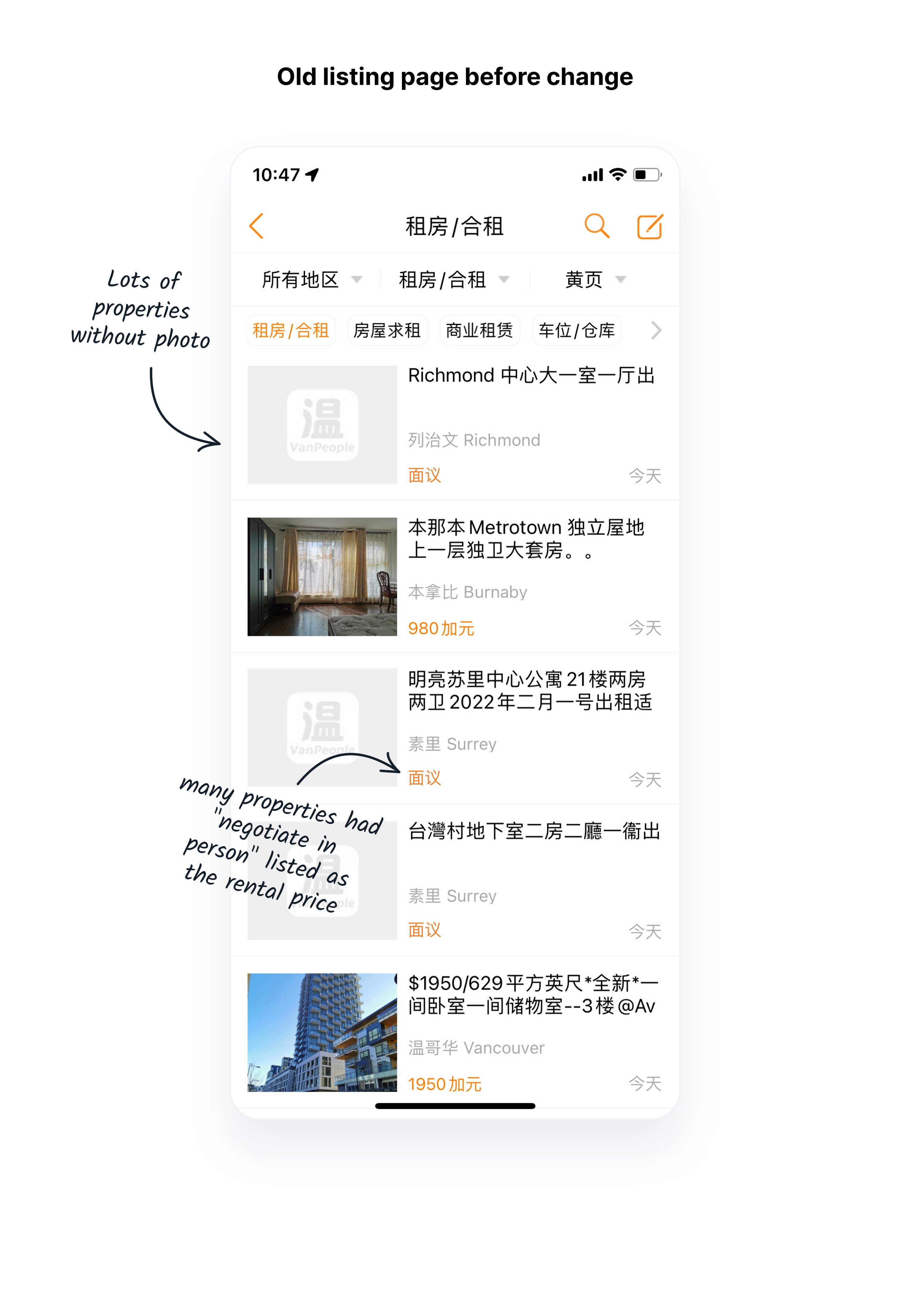
% of listing with photos and a clear rental price
Increased by
+200%
From around 3 in 10 to 9 in 10
Avg. number of rental listing posted daily
Increased by
+22%
From around 110 to around 135
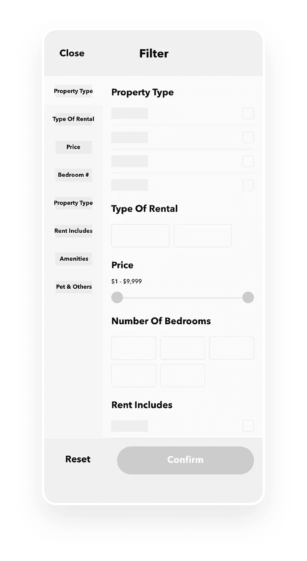
Introduce a new search result filter
The primary objective of designing a search result filter was to create a tool that enables users to efficiently narrow down rental search results based on their personal preferences, reducing the time spent scrolling through property listings.
Research user's needs and expectations
We conducted a brief round of user research with 7 colleagues who have rented homes in the last 6 months, documenting their key considerations when searching for a rental property.
Given our urgency to implement a filter function, after discussing the matter with the company founder, we agreed that the design of the initial version should not be overly complex and should be tailored to the needs of our Chinese target audience.

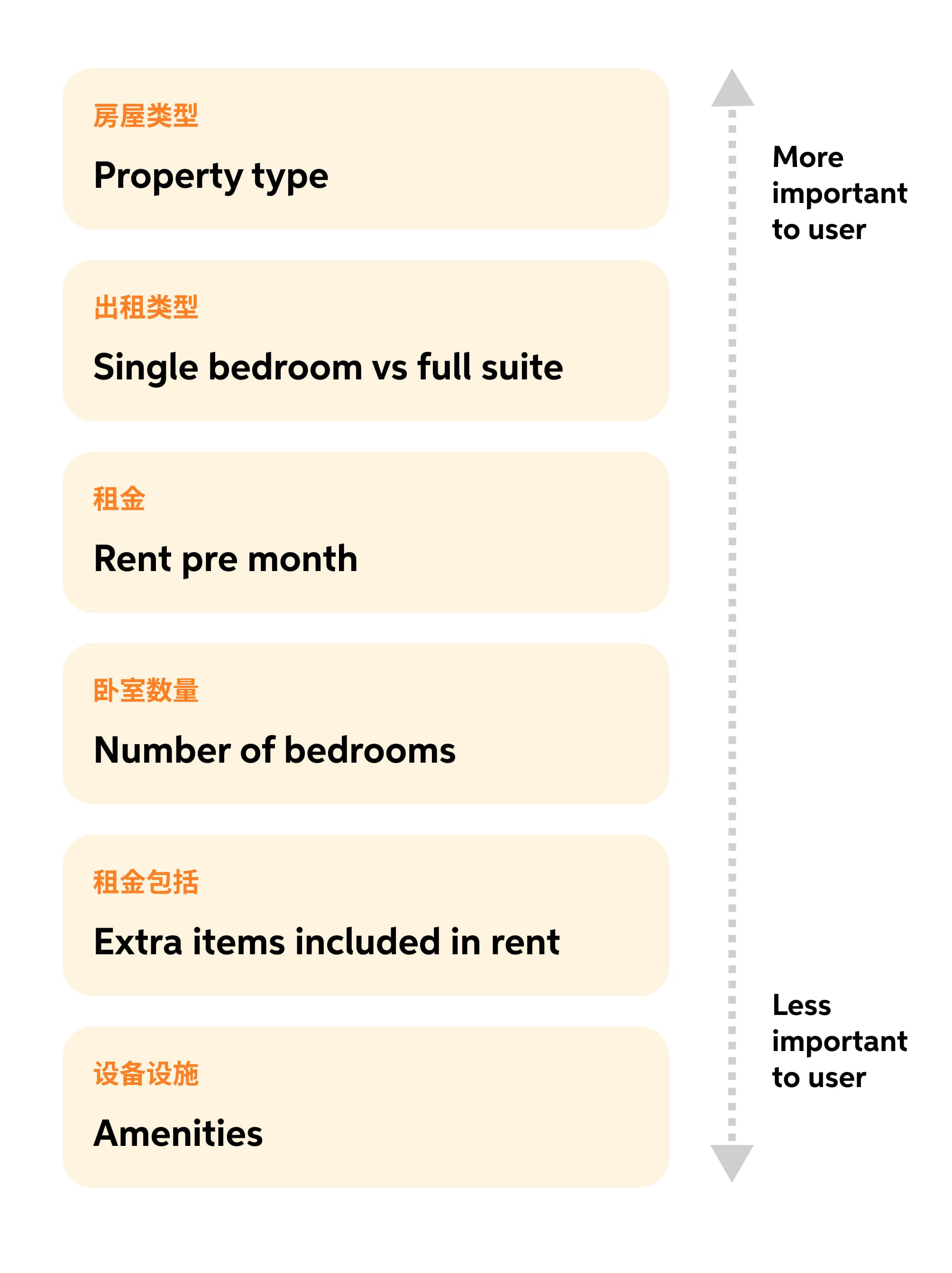
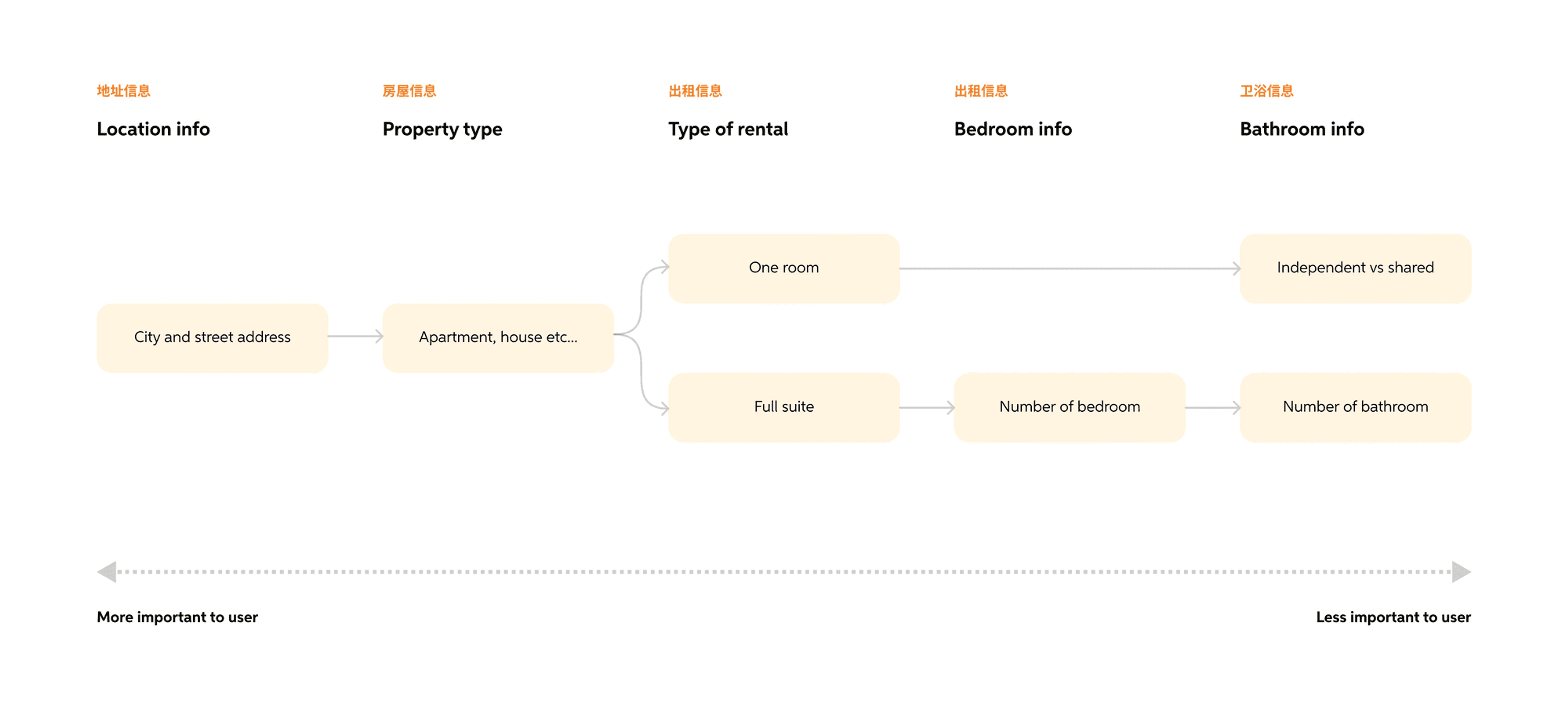
Define the essentials
After having gathered a round of input from the colleagues I talked to earlier, I moved onto coming up with an essential list of categories to be included for the MVP version of the filter.

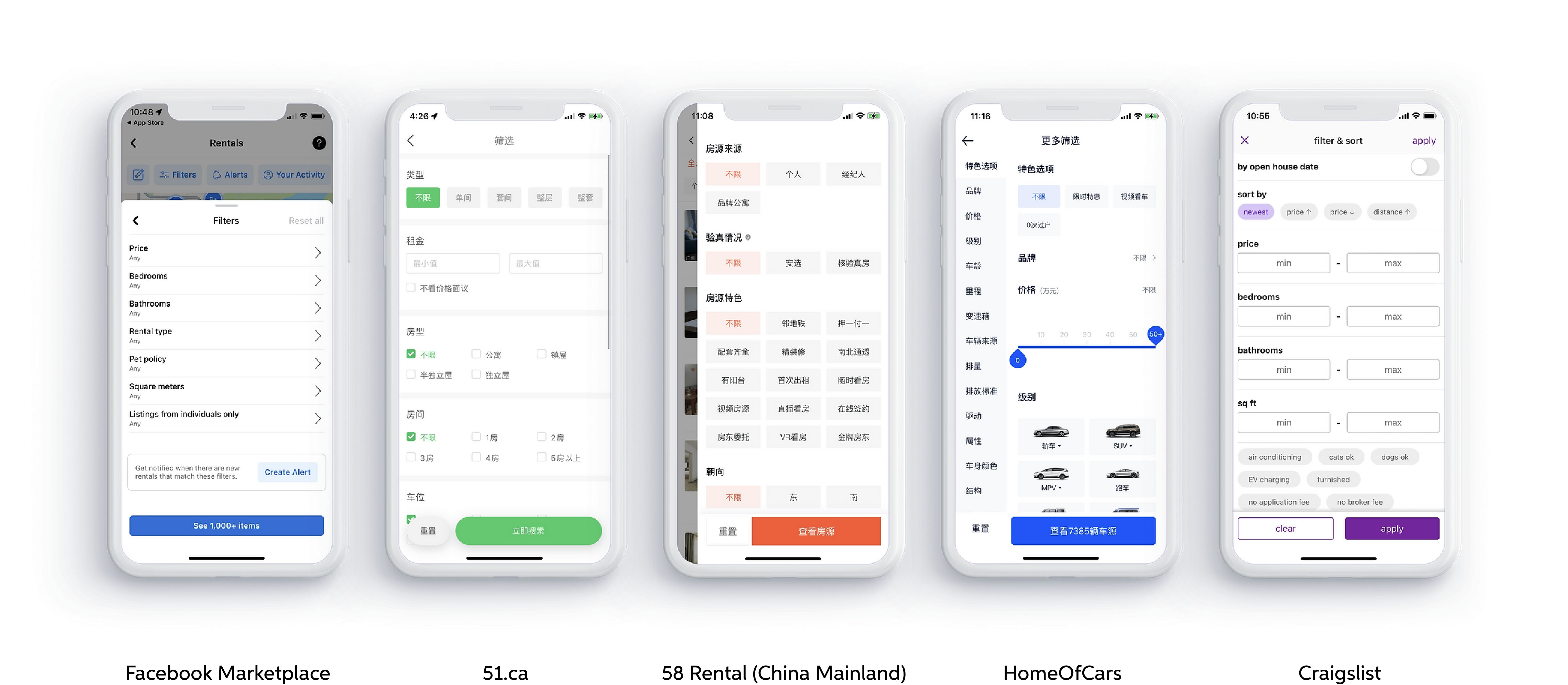
Gather inspiration
Before embarking on design ideation, I gathered inspiration and insights by studying rental filter designs used by other major platforms. Subsequently, I expanded my research to include designs from non-rental-related platforms as well.
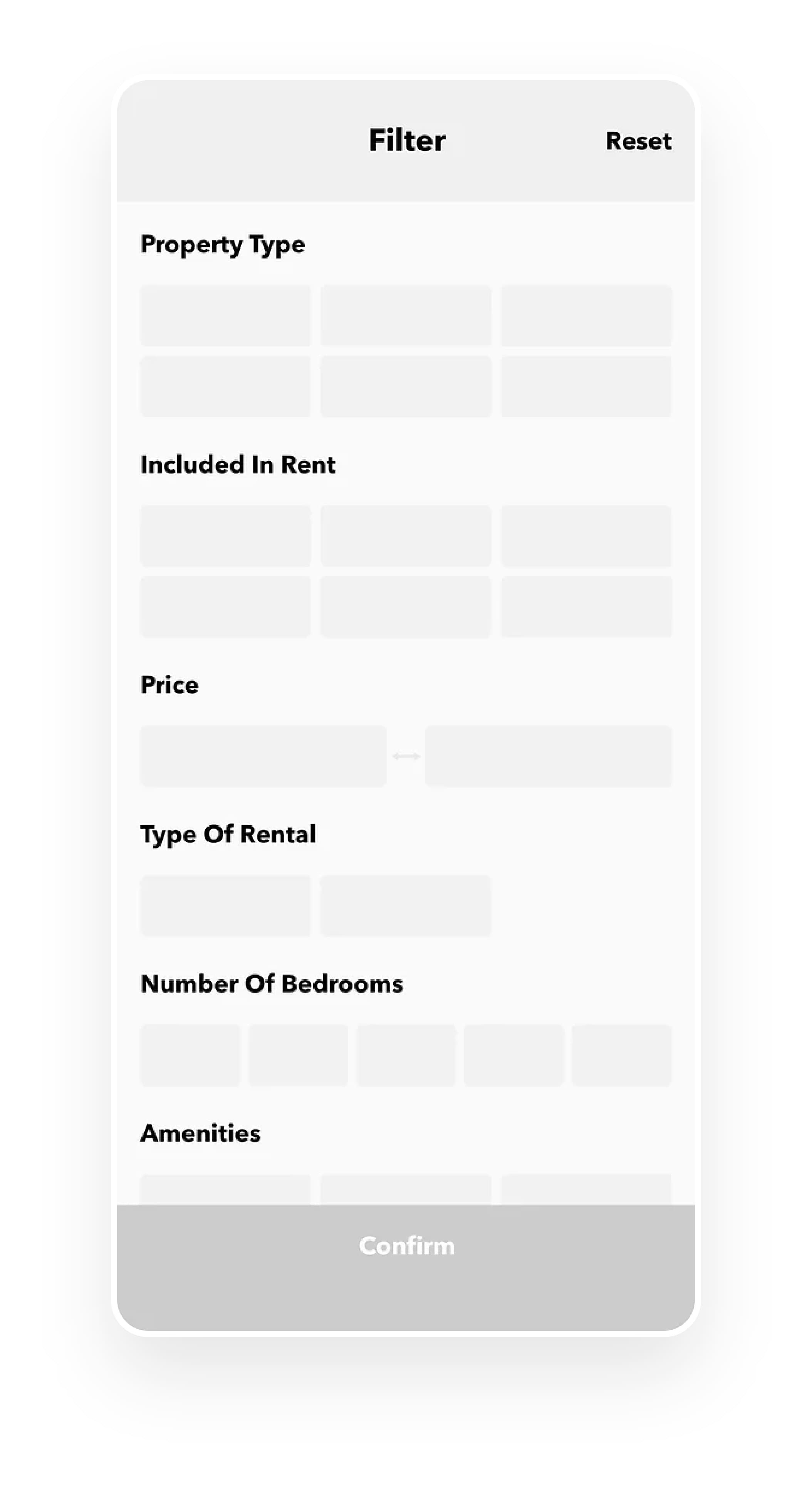
Finalize filter requirements
Before proceeding with the design phase, I compiled a list of specific product design requirements for each section of our filter. This was achieved by cross-referencing the findings from our market research with the feedback obtained from the user interviews conducted earlier.
Need to have a filter to narrow down results
Condo, House, Townhouse and Back Alley Units.
Display what else do the rent include
Water, electricity, internet, and natural gas (not heat).
Number of bedrooms
Use a “more or equal to” [1+,2+,3+ etc...] system so that users can always browse around to see if there are additional options with more rooms within the same price range.
Display what type of rental it is
One room only vs full suite.
Amenities
We narrow the options down to in-suite laundry, independent kitchen, basic electronics, basic furniture, central air conditioning, independent washroom, independent parking slot, and EV charging.
Pets & Other
You can choose to view units that allow for cats, and dogs. You can also choose to view rental units that do not have gender preferences. At last, you can view rentals with pictures only.
A/B testing between two variations
By applying the general design patterns gathered from the inspiration-gathering process and integrating the list of design requirements generated earlier, I have developed two design variations.
Variation #1
Opted for a straightforward layout that provides users with a top-down view of all the items they can use to filter the search results.
Variation #2
A more advanced version was created with a side navigation bar that capitalizes on the box-like shape of Chinese characters. This approach enabled us to use a larger font size for section titles in the navigation bar, improving readability.
Avg. task completion time
v2 was 26% faster than v1
14 seconds vs 19 seconds
The overall usability of variation #2 surpassed that of variation #1. Participants took an average of 19 seconds to complete the task in V1, whereas V2 had an average of 14 seconds.
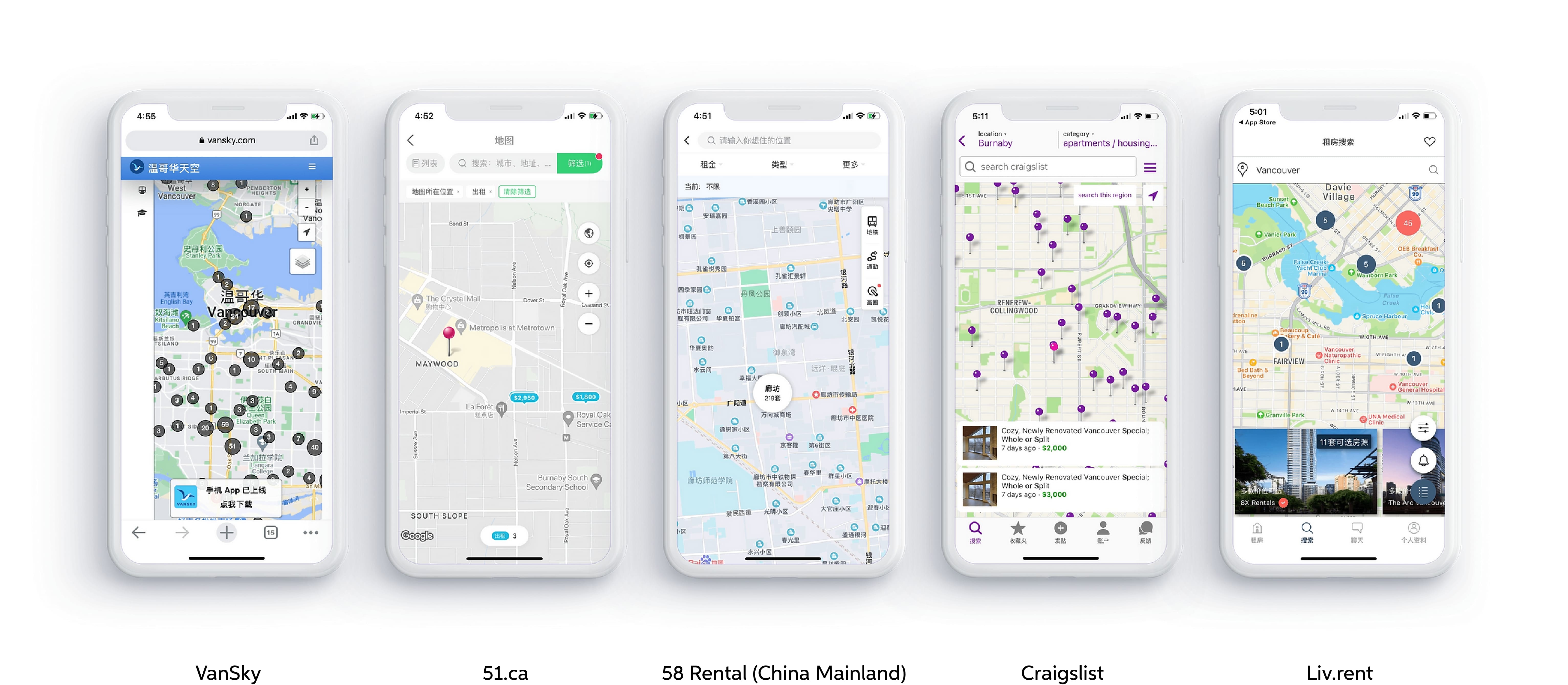
Introduce search by map
This entire feature was designed end-to-end by Ginny Wang, the other product designer who was on my team. I worked closely with her as product manager to ensure that the feature was going to provide the best possible user experience for our users in the end.

Research the core user needs of a property map-searching tool
Ginny conducted a round of user research and organized a short list of items that represented the core user needs for using such a tool.
Need to have a filter to narrow down results
Should include the same property filter.
Search for properties near skytrain
Should provide a way to only show properties near skytrain stations
Search for homes near specific school
Should provide a way to only show properties near elementary schools, collages, and universities
Have a lag-free interaction experience
Cannot constantly have freezes when users are scrolling across the map
Create clarity from ambiguity
She then created a high-level information architectural chart with the data she gathered from the research phase.

Gather inspiration
She also gathered design inspiration by studying similar features used by other major platforms.
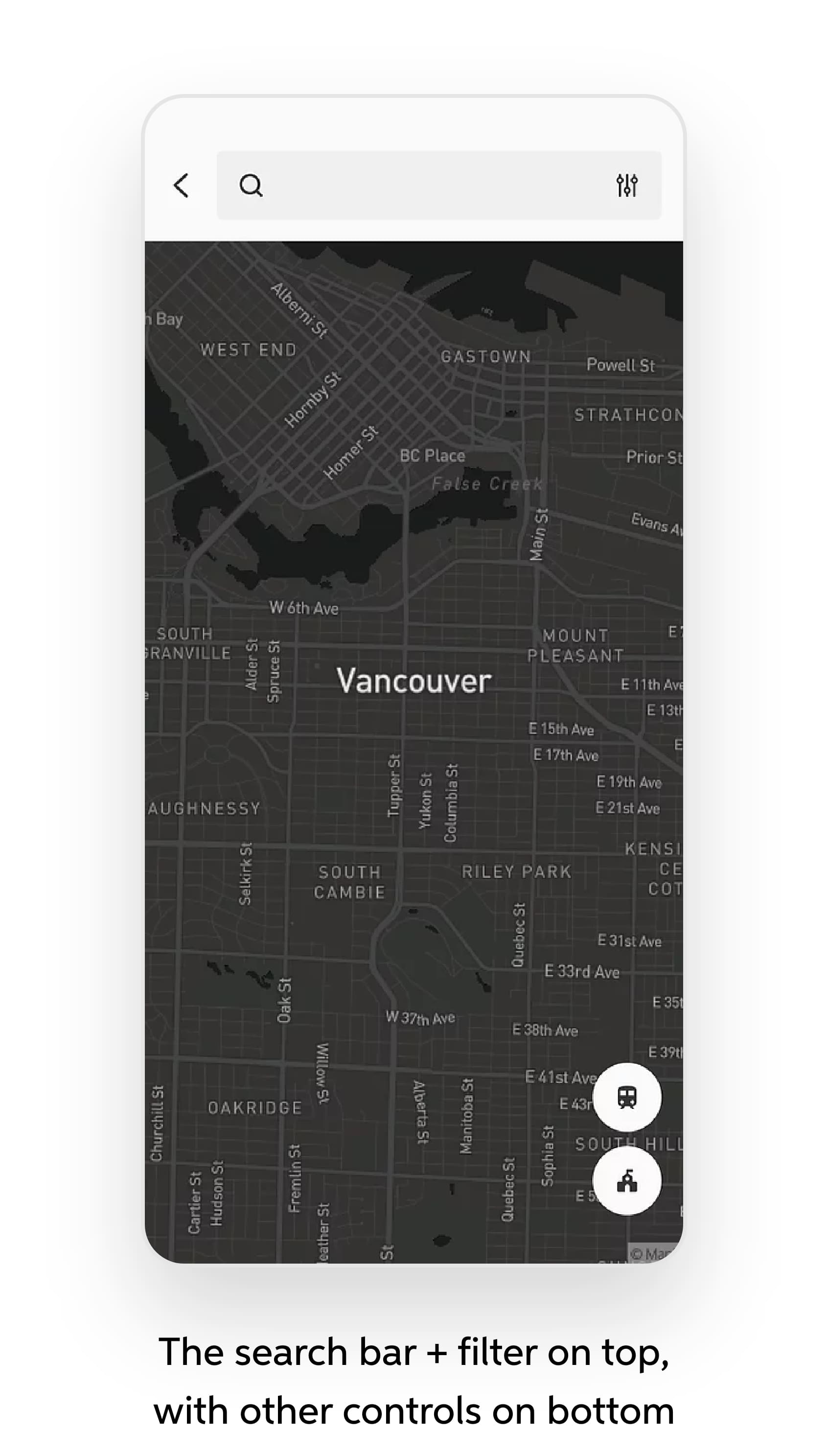
Experiment with different layouts
At first, we decided on a more traditional layout. Many similar products we came across had the search bar located at the top and an area of control at the bottom.

Agree on a layout in the end
Due to the search function's inability to locate listings by address, we initially made it less prominent while planning improvements.
Fortunately, after redesigning, feedback was positive, especially for the version featuring a fullscreen map presentation. Users appreciated the cleaner design and increased space for listing display. Despite reduced visual space, all controls remained noticeable, enhancing user experience.
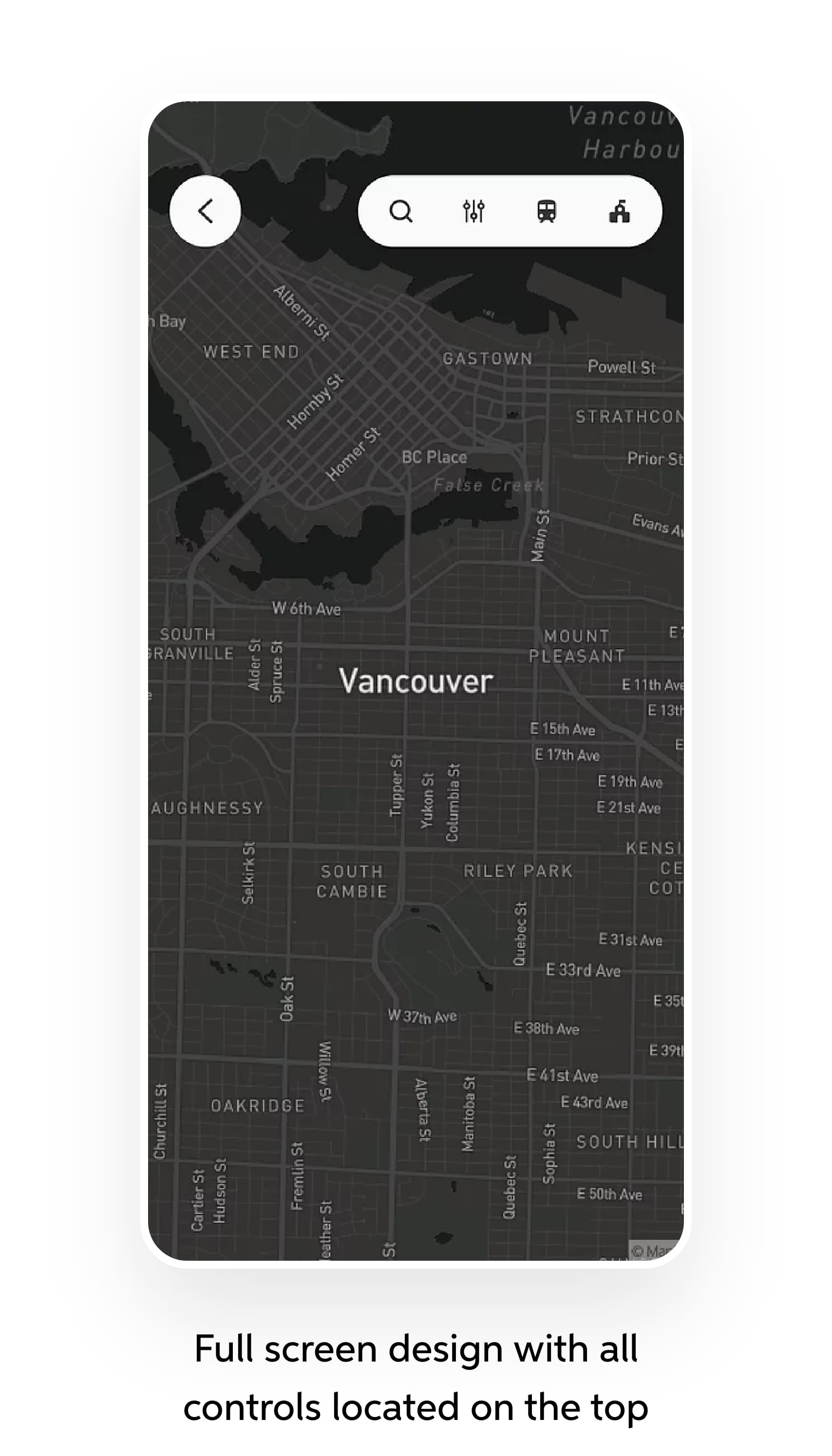
Final high fidelity design
After close to a month on crafting the design, we have finally arrived at a visually appealing, and immersive property browsing experience. After launching the feature in late 2021, the feature is now becoming more popular as each day goes by.
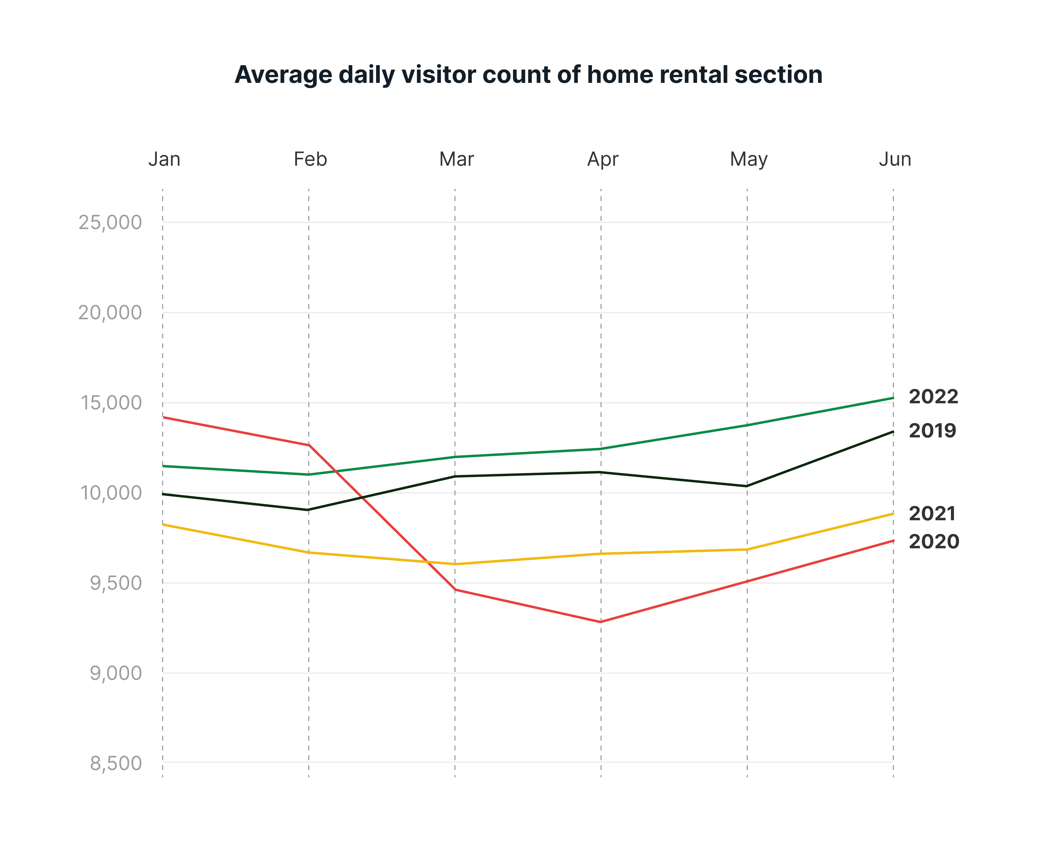
Noticeably more visitors and a marked improvement in user satisfaction
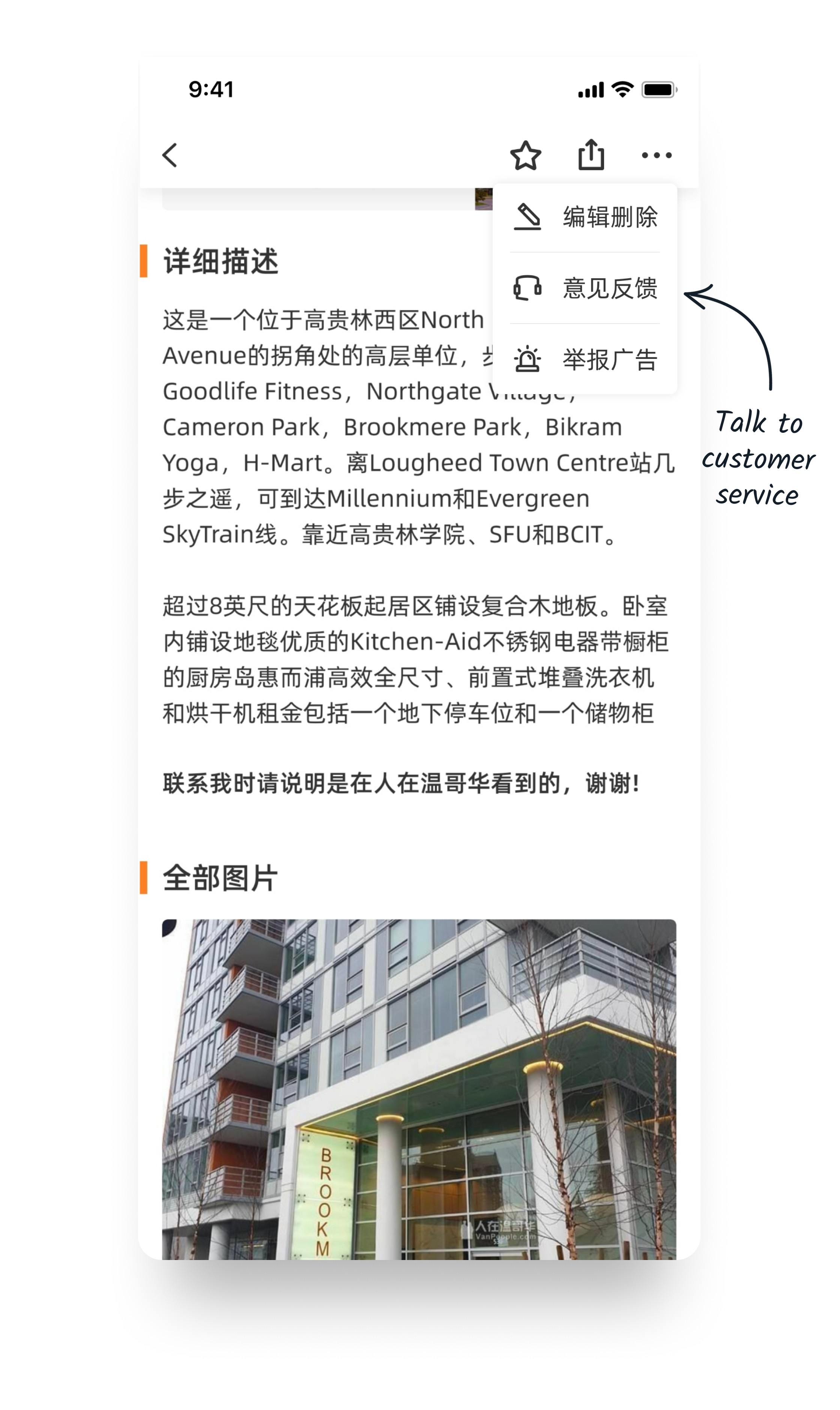
A month after introducing new search refinement options, we noticed a substantial increase in daily visitors. Through a new feedback channel I created, I have also learned that many users have regained confidence in our platform's ability to deliver high-quality rental options.
Daily visitor count of VanPeople home rental
Increased by
+21%
From around 12k to ~14.5k
% of user who would recommend us to others
Improved by
+34%
From 66% to 89%

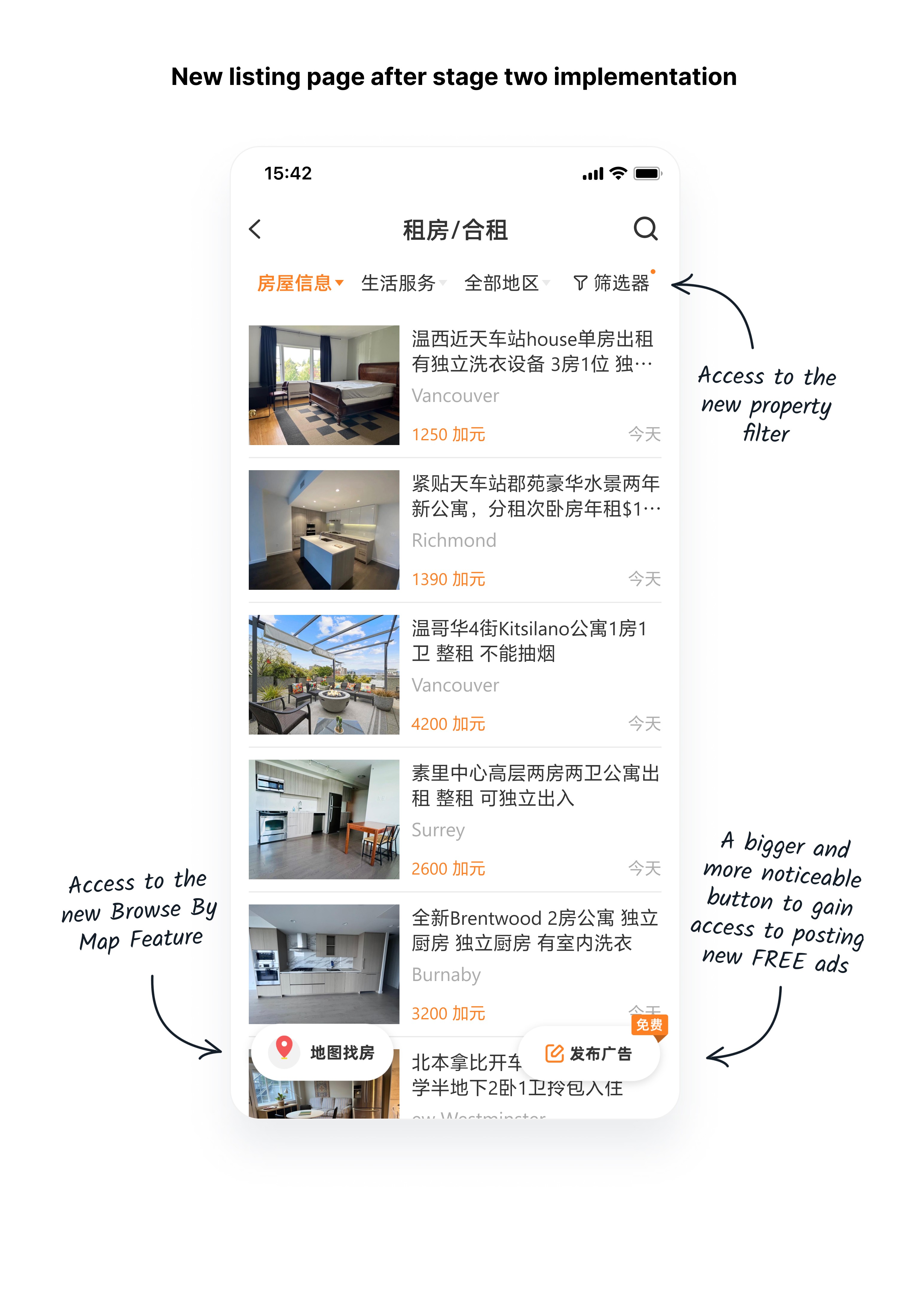
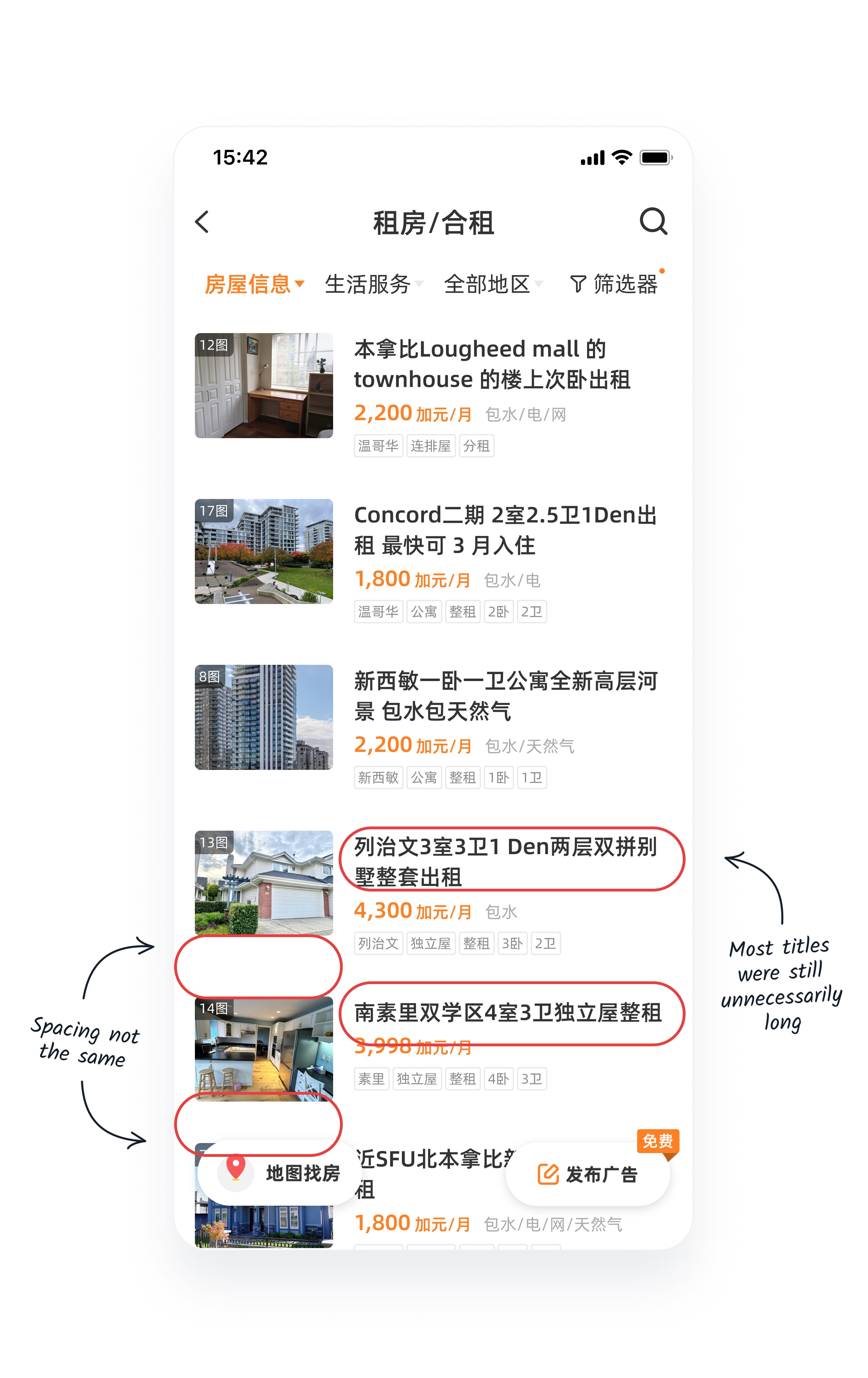
Revamp the property listing page
According to the execution plan set at the beginning of this project, upon completing the previous stages, the next step was to further enhance the listing browsing experience to enable users to extract information more efficiently.

Audit the usability of the old property list page
During the audit, the most notable issue I found was the low efficiency in information extraction due to the ineffective presentation of meaningful content.
Gather inspiration on property cards design
During competitor research to gather inspiration for property card design, I discovered several common trends among other players in the industry:
Property info tags/labels
Most companies would use small tags or labels to display essential details about each listing in a concise format. This includes key information such as property type, price, location, number of bedrooms/bathrooms, and any standout features or amenities.
Auto-generated listing titles
Most companies would use short auto-generated listings titles that are short and informative.
Various format in display location info
For companies in China, the location information tend to be way more specific since the users would input their location information really differently than the platform in the west.
Revamp the presentation our property info by introducing a label system
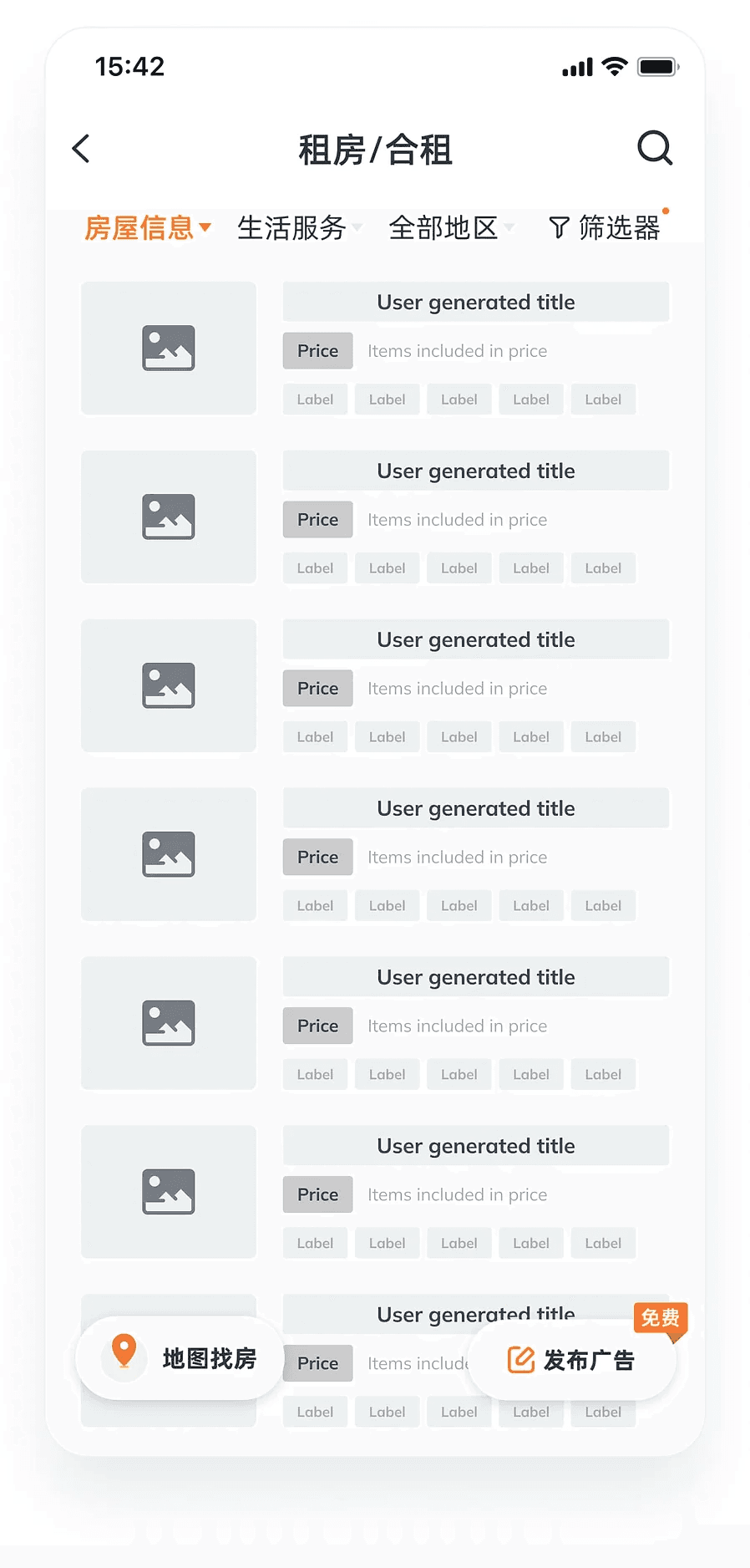
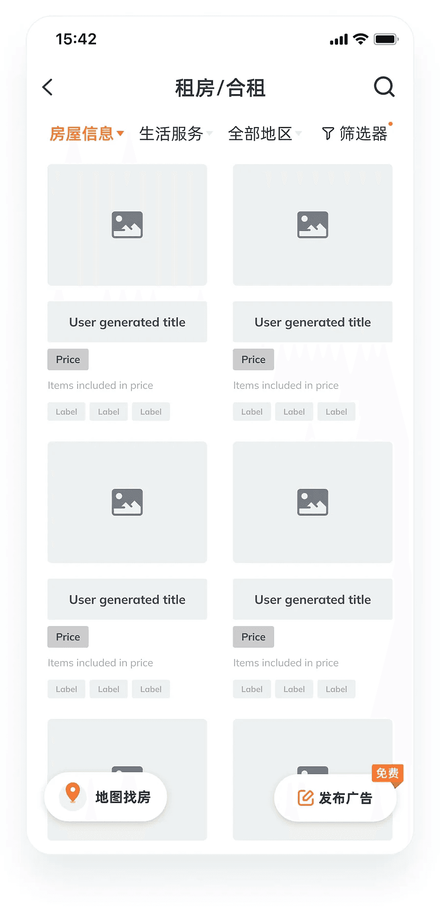
I proceeded to draft variations of layouts for presenting property information. I ended up with a grid and a list layout catering to the browsing needs of different users.
Given the constrained horizontal space in both layouts, we needed to be strategic about which details to prioritize in the label system. To inform our decision, I revisited the user feedback collected during our interview sessions.
From this data, I developed a logic chart outlining how information would be displayed through the label system ensuring that only the most essential details related to a user's home rental decision-making process would be featured.
Arrive at version #1 after considerable exploration
During design exploration, I found that using colors on the labels could easily clutter the browsing experience. Therefore, after experimenting with various approaches, I decided to adopt a design that is easier on the eyes.

Initial usability test with live data did not go well
When we ran a usability test on version #1, we came to realize that the new version's one-line title was not able to fully display the lengthy titles that our users creating.

Explore different ways to optimize the design
First solution - Give the 2 lines back to all the titles
The initial approach I considered was simply giving back the two lines of display space to all the titles.
A "more creative" solution - Automatically generate shorter format titles
Given that many rental platforms employed auto-generated listing titles, I considered adopting a similar approach. Since our users' titles often conveyed similar information to what the new property label system provided, I proposed merging the content of these labels to form the new titles for all listings.
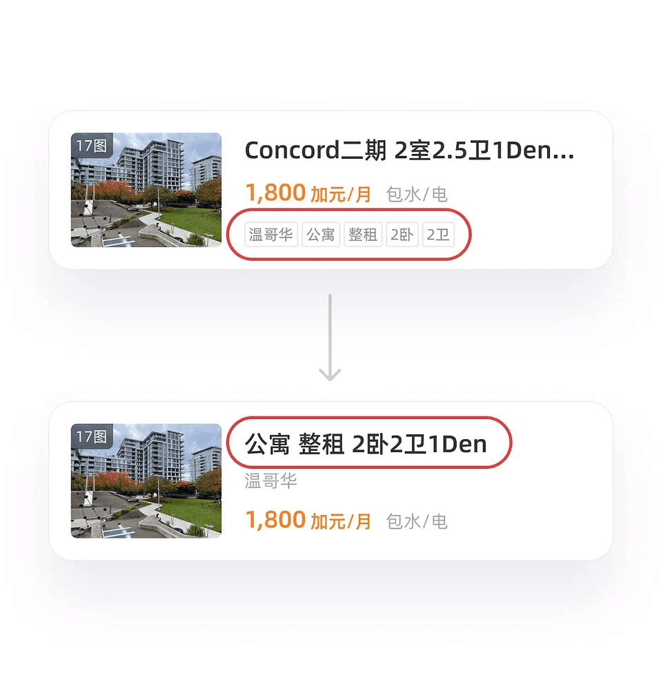
The "creative" solution backfired - Listings became indistinguishable
It seems that the simplest solution often turns out to be the best one
So after having interviewed 7 users who have posted a property for rental recently, I came to realize that the best solution is actually simple; all I had to do was just reduce the word count limit for the title by half, and our users would automatically find more creative ways themselves to write unique looking titles that are shorter and more precise.

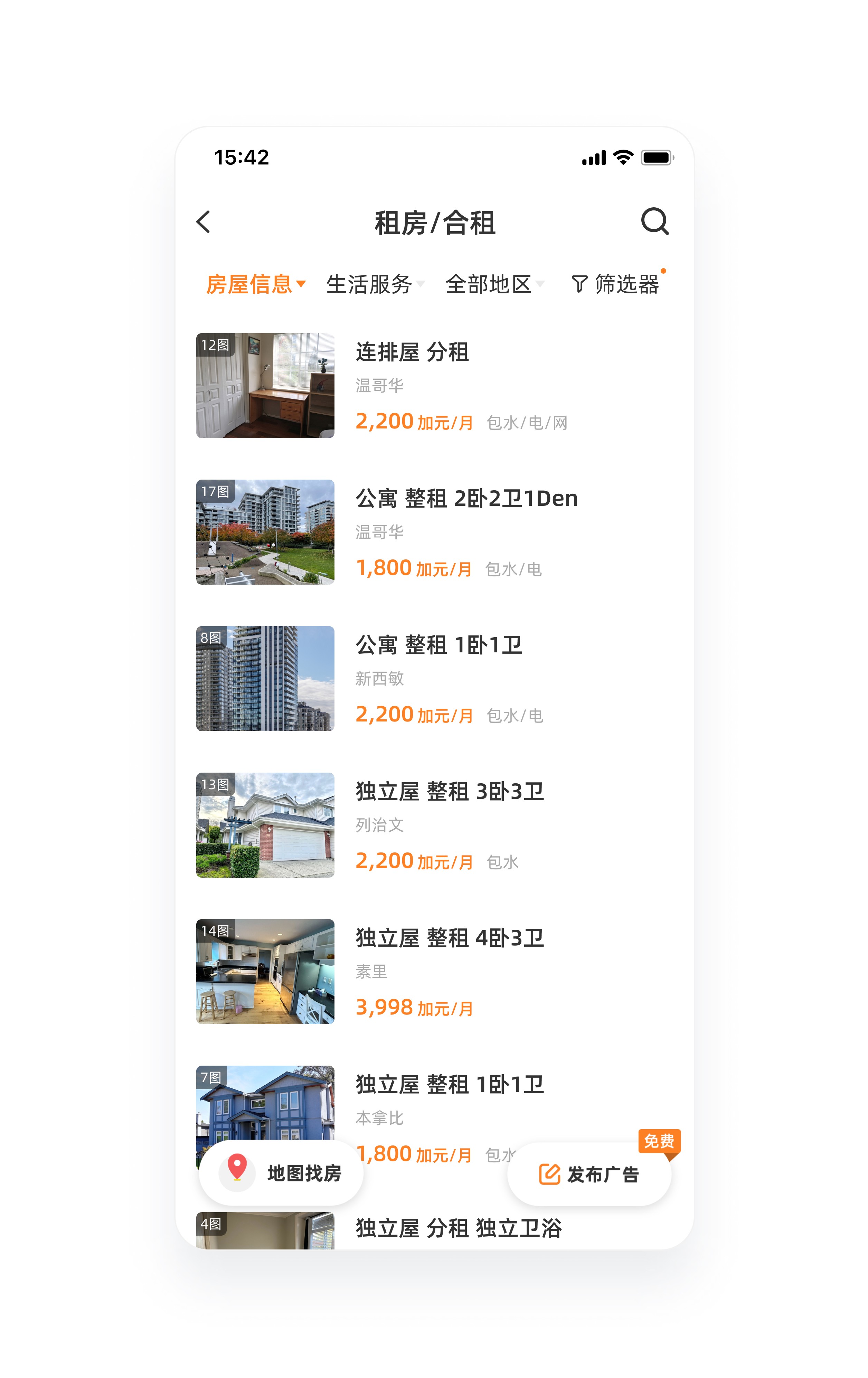
Final version for release
After about 3 and a half months of design, refiment, and development, we have finally released a refreshed property listing page that allowed users to make home rental decisions faster than before.


Following the release, we received a range of positive feedback directly from our users
While I was unable to gather numerical evidence indicating a significant improvement in decision-making speed, we did receive positive feedback from many users after launching the newly designed property listing page.
They reported that browsing for properties with the new design was much easier and required less effort compared to before.

Upgrade and innovate the monetization model to drive higher earnings
With all the planned tasks from the previous three stages now completed, VanPeople's home rental section has experienced a notable uptick in daily visitor counts and overall user satisfaction. Given these encouraging results, I believe it's time to explore additional opportunities to capitalize on the increasing traffic of VanPeople's mobile home rental section.
Two fold approach
After consulting with stakeholders across the company, I've identified two key objectives to enhance our monetization capabilities.
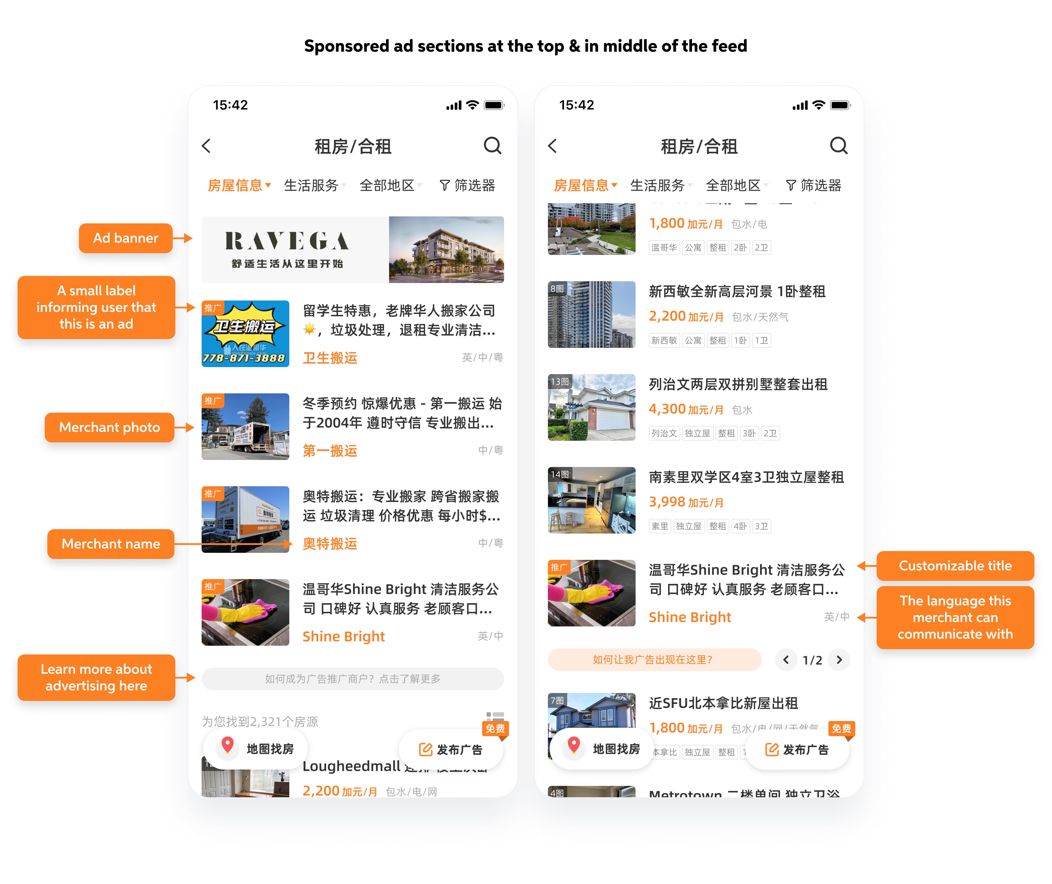
More advertising opportunities at high-traffic locations for business clients
Recognizing that most of our revenue stems from sponsored business ads, the sales team and I chose to add a dedicated ad section at the top of the property listing page to leverage the high traffic effectively.

Provide options for regular users to buy additional listing exposure
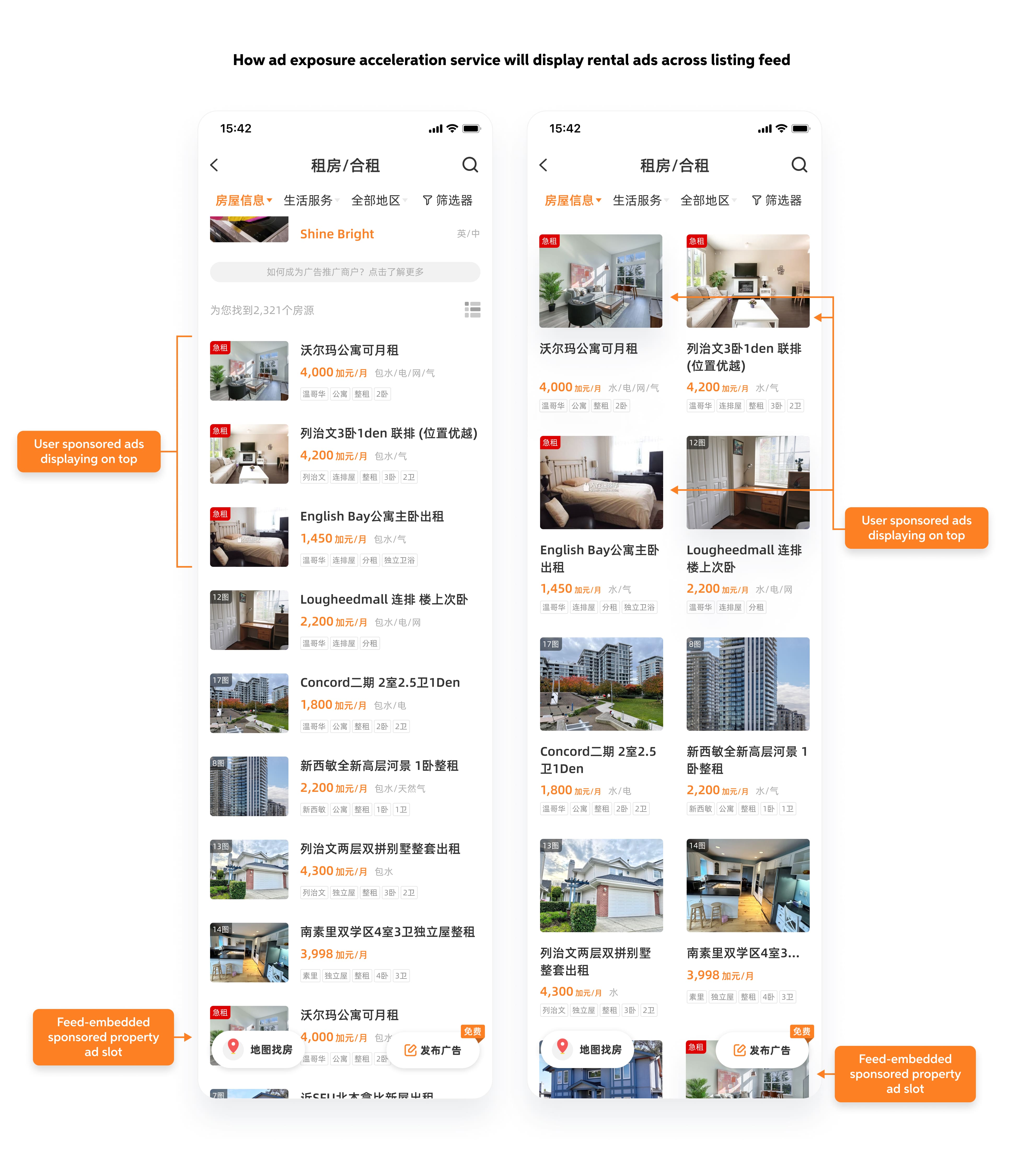
How to introduce the new exposure acceleration service
The primary challenge I encountered was promoting our new service to users effectively without causing annoyance. After thoughtful consideration, I identified the opportune moment for promotion: right after users complete the listing of a rental property.
The objective was to introduce the exposure acceleration service as a friendly, helpful tip to enhance the effectiveness of their rental ads with a small fee.
An intuitive checkout process
To streamline the checkout process, I drafted up a payment flow that would enable users to potentially complete payment in as few as two steps.

Key criteria for a successful checkout process
After extensive discussions with our users online, I've identified four crucial design criteria to effectively market our new accelerated exposure service.
First
User should have control over the exposure to promotional material
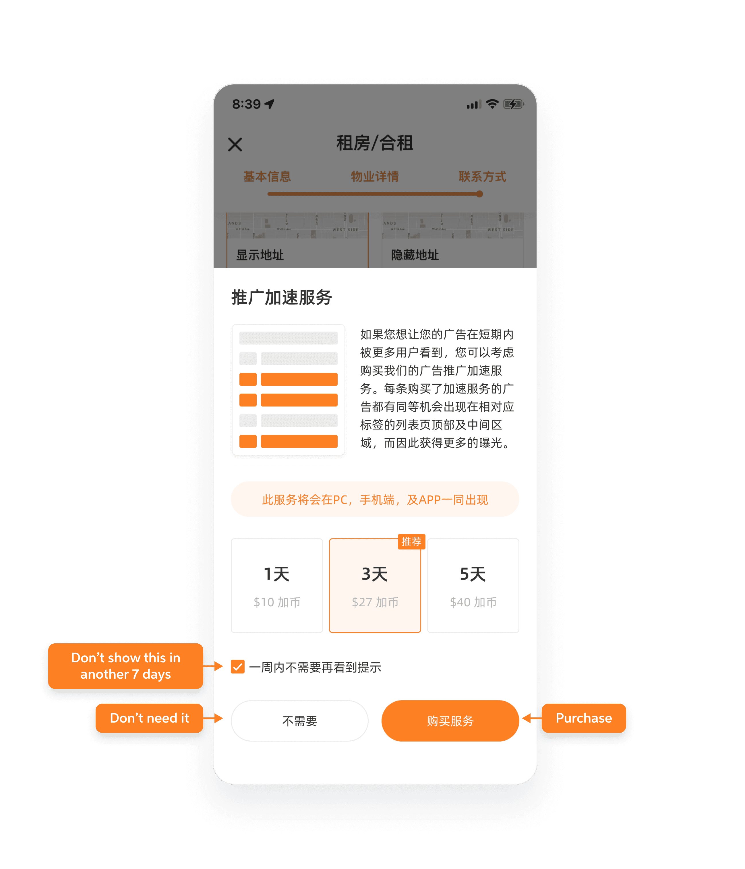
Second
The material presented should be short and easy to digest
Third
Pricing should be very transparent, ensuring that people know exactly what they are paying for
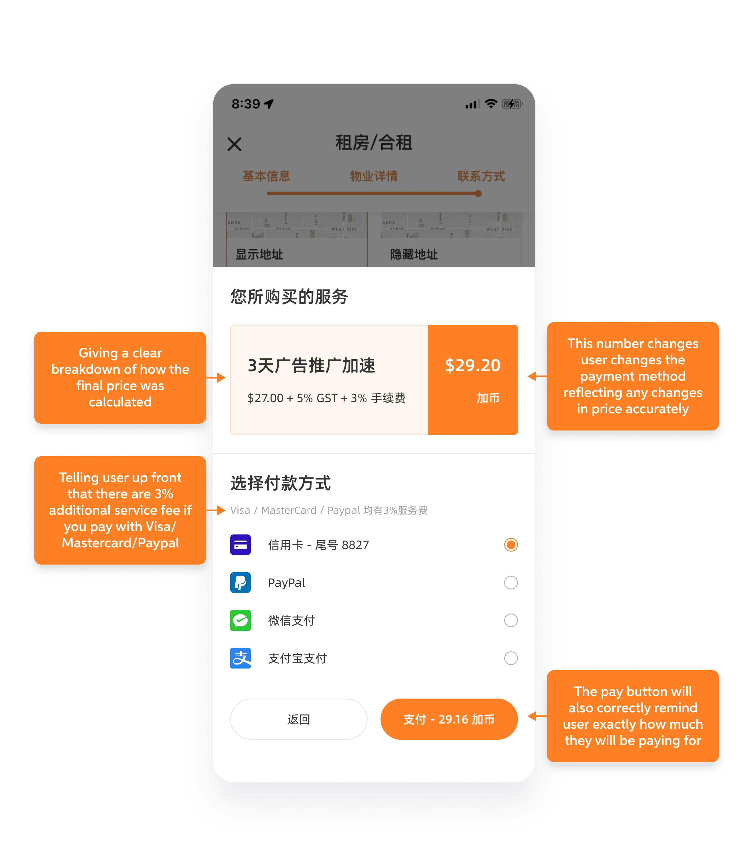
Lastly
Users should be informed about the exact duration of the service and the renewal process if needed
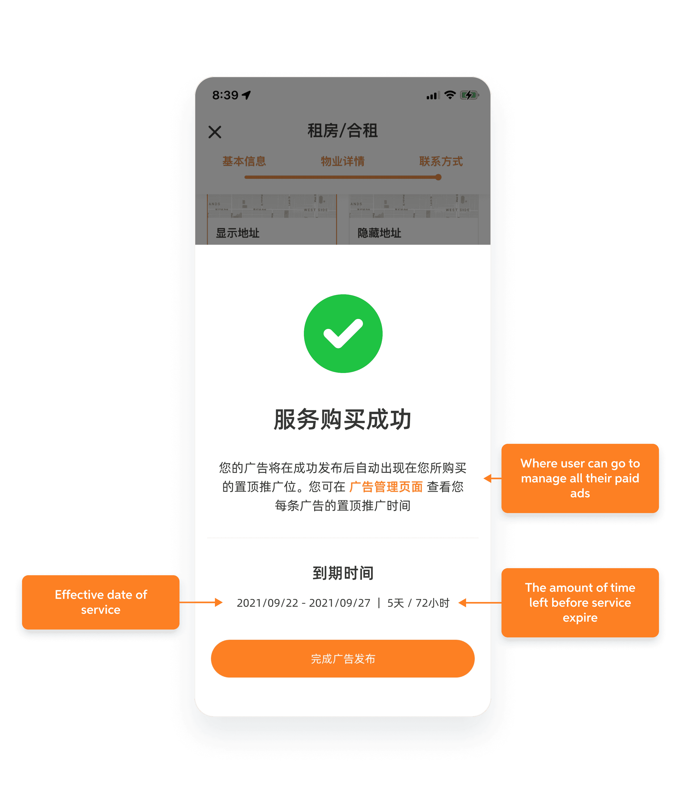
Payment flow in action
Project overall impact & result
Towards the end of May 2022, I conducted a comprehensive analysis by documenting the average daily visitor count and daily property posted between January to Jun 2022. I then compared the six-month average of both of these two factors to the same period in 2020 and 2021.
Data was synthesized using a combination of Google Analytics data and insights gathered from our internal native app metric monitoring tools.

Project impact over company revenue
Since my departure from the company in early June 2022, I haven't had the opportunity to personally observe the long-term impact of the new monetization model on the company's revenue. However, the product manager who succeeded me was kind enough to share some data nine months after my departure.
Monthly revenue from home rental
+80%
Went from ~8,000 CAD to ~14,000 CAD
Considering that the monetization changes were deployed across all platforms including desktop, mobile web, and native app, the impact of the new monetization methods was assessed by measuring the total monthly revenue generated by the home rental section across all platforms.
Passive income from non-business user
+400%
Went from ~500 CAD to ~2,000 CAD
The project effectively shifted VanPeople's business model from solely targeting businesses to also targeting platform users. Revenue generated from selling ad exposure acceleration services to users of the home rental section surged to 2,000 CAD/month within three quarters. Notably, this new income source didn't incur commission cuts as it bypassed sales personnel.
At the time of measurement, the revenue generated from selling this service to users across the entire classified listing platform was estimated to be around 15,000 CAD per month.
