Project overview
The multi-stage revamp of the entire VanPeople classified listing home rental's mobile experience was a "cornerstone product enhancement" initiative spanning approximately a year and a half.
The main challenge I faced with this project was finding a way to formulate and carry out a design plan that would allow my team to navigate around manpower and technical limitations to systematically improve the overall credibility of listings on the platform while also enhancing the overall rental searching experience step by step. The whole project felt like fixing a partially damaged engine of a car while it is still running at high speed with tools bought on Temu.
Ultimately, the project has resulted in the platform attracting more daily visitors, featuring more trustworthy rental listings, receiving a higher volume of property listings on a daily basis, and generating additional revenue from a group of users that were previously overlooked.


The state of VanPeople home rental section at the end of 2019
10 years after its launch, benefiting from the massive influx of Chinese international students coming to study abroad in Canada, VanPeople's classified listing platform has grown to become the most well-known platform for Chinese living in British Columbia to look for home rentals.
However, as more of the general Chinese user base was getting younger, VPP's classified listing's outdated design, the lack of modern filter features, and the massive amount of low credibility rental listings populating the browsing pages have resulted in the platform having major difficulty in attracting new users.
More people have started to search for rental properties elsewhere
By comparing the data collected from December 2019 to June 2020 with that of December 2018 to June 2019, we noticed troubling drops in some key metrics for the home rental section.

The home rental section's average daily visit count fell from 12.5k down to 9.7k

The average amount of new rental listings being posted each day went from 13 down to 118.
Initially, we assumed that the decrease in activity on our platform was due to the impact of COVID-19. However, we noticed that even after the lockdown had ended, both the number of daily visitors and new listings continued to decrease over several months. This led us to conclude that the underlying cause of the problem was likely something other than the pandemic.
Research to determine the causes of the drops we were experiencing
To gain insight into why the platform was losing popularity, we initiated a comprehensive research effort, comprising surveys, 1 on 1 interviews, user journey mapping and market competitor analysis.
User surveys
We began the research by conducting a round of qualitative research using Tencent Questionnaire during Dec 2020. To ensure sufficient participation, we implemented a well-designed floating participant recruitment banner at the bottom of the classified listing's homepage, and we also ran a raffle offering shopping gift cards as rewards for participants.
However, due to the notable resource investment required and the fact that many of our users actively used multiple sections across the VanPeople classified listing, only a portion of the survey questions were dedicated to collecting user feedback on the home rental section's user experience.


At the end of the survey, we included a question asking participants if they would like to leave their contact information to join any additional qualitative user research, with the incentive of receiving additional prizes.
Qualitative research
In early 2021, over a two-week period, we conducted interviews by inviting 20 participants from the pool of willing volunteers we had gathered through the earlier survey.
Participants were randomly selected to ensure a representative sample, including both active users from the past six months and those who had not been active for some time.
Invitations were sent via SMS and email.

Notable interview findings
When it came to insights related to the home rental section, most of the issues we discovered during the interviews were related to low listing credibility, a lack of tools to narrow down search results, and a tedious rental property listing flow.
These findings were fairly consistent with the results of the survey we conducted earlier, but surprisingly, the number of people who complained about our search function was much lower than what we have expected.
17/20 of the participants complained that many rental listings did not seem that credible.
16/20 of the participants reported that looking for homes was taking too much effort as there were no ways for users to narrow down their options.
4/5 of the participants who have posted ads before reported that they do not really feel like adding detailed rental info when they list properties on our platform.
Lily Chen - 3rd year UBC student
Studying economics and working part-time
Peter Wang - 43 years old home owner
Owner of a construction contracting firm
CIndy Zhu - Stay home mom
Immigrated to Canada to take care of her son attending high school
Jack Liu - SFU new grad
Working as a marketing coordinator at a local startup
User journey mapping
To better visualize the pain points experienced by our users, we created a user journey map by using the data we gathered from the user interviews we conducted earlier.

Market competitor research
To better understand our position in the market, my team compared VPP's rental section to other popular platforms used by our users. Overall, posting a property on our platform was the simplest compared to other companies I evaluated.
With VanPeople, users can list their property for rent
Without the need for an account.
By only providing a short ad title such as '[room for rent]' with a brief 20-character description.
Without providing any photos, an address, or specify the number of bedrooms or bathrooms.
However, this ease of posting has resulted in VanPeople having the lowest listing credibility.

How were all the issues we found connected to each other?
After going over the findings we gathered during the research stage, my team has arrived at the following conclusion:

The lack of incentive to add information to the rental listings, resulting in poor listing credibility, created a chain reaction that continually drove users away.


Goals & constraints
After connecting the dots and reviewing all the problems discovered during the research phase, my team has established the following overarching goal for this project.

Implement changes to help Chinese home renters search for homes more effectively and with more confidence.
Notable constraints
While brainstorming ideas on how to achieve the project goal, we became aware of two constraints that will limit the extent of what we can accomplish with this revamp project.
01
User growth vs user experience continuity
Although attracting younger users was a primary strategy for expanding the platform's user base, we had to consider that the majority of VanPeople users were older individuals who were less adaptable to changes and had become accustomed to the platform's consistent appearance over the past four years.
Thus, drastically changing the look and feel of everything all at once was deemed too risky, as it might create too much disruption to the current user experience.

02
Cannot meaningfully improve search experience due to outdated data framework
Despite our awareness of the issues stemming from our outdated search function, unfortunately, there was little we could do in the near future. The slow search speed and the inability to search for items beyond using exact keywords were artifacts of a technically outdated back-end framework that has been in use since the founding of the company in 2008.
Multi-stage execution
Due to limited resources, my team faced a significant challenge in executing the revamp project for the home rental section. Moreover, the product we were responsible for had been losing users steadily. To address this, we decided to break down the project into multiple stages, each with its own success metrics. This approach allowed us to introduce improvements quickly and effectively, despite the constraints we faced.


Setting a better design foundation
The old UI for the VanPeople classified listing appeared to be utilizing multiple design systems simultaneously. Users could encounter varying font sizes and color usage across different sections within the classified listing platform. To compound the issue, the platform employed different design styles for its web and native app client sides, each appearing outdated and poorly designed in its own right.
Hence, I believed it would greatly benefit us to base the new design on a relatively basic but more coherent design system that provides guidelines for all future font and color usage.


Revamp the property listing flow
The redesign of the property listing flow had two goals. Firstly, the project aimed to reduce the time users spend filling out the content of a property listing ad. Secondly, it aimed to encourage users to provide more detailed information in the future when using the new flow.

Gather design requirements & creating an wireframe
I initiated the property listing flow redesign by identifying the essential information necessary for creating a comprehensive listing post. I meticulously reviewed the contents of over 100 listings and compiled a list of items that were most frequently included by our users in their posts.
To validate the list and ensure it aligned with the actual expectations of our users, I consulted with 5 colleagues who had actively used our rental service in the past few months.
Subsequently, I prioritized the items on the list based on the feedback gathered during this mini round of user research.

Introducing new interactive components to improve workflow efficiency
To streamline the property listing process and reduce user time investment, I incorporated elements such as checkboxes, dropdown buttons, and auto-complete mechanisms into the design. This allowed users to avoid manual entry of detailed property information.
It's important to note that I employed distinct button styles for multi-option and single-option menus to enhance visual intuitiveness in the design.

Arriving at Version 1.0 - An improved one-page design basing off of the old design
Due to time constraints, I opted for a straightforward one-page design, essentially an extended version of the previous layout.
Following a brief validation test with the same 5 colleagues I consulted earlier, all 5 of them did agree that they would see themselves inputting more detailed property information with this new design.
Despite these findings, the initial draft was deemed overwhelming by the participants. One out of five did not complete the test, feeling that the page demanded too much information at once. It became clear that consolidating too much information into a single long page led to information overload.
Coming up with an alternative multipage approach
After some additional exploration, I thought if the problem was users feeling like they were seeing too much information at once, perhaps I could break them up and get users to see only smaller chunks of the whole process one at a time. As a result, I created a three-page, multi-stage workflow designed to guide users through smaller chunks of the process, one step at a time, with some pages being potentially 100% skippable.

Version 2 / Final version
Following thorough exploration, I decided on the hi-fi version presented below. To verify that this new approach was more effective at conveying information than the initial version, I conducted a validation test with my co-workers.
The consensus among participants was that the redesigned interface significantly improved usability and information digestibility. Notably, the new option to skip entire page also helped in preventing any instances of participants abandoning their task half way.


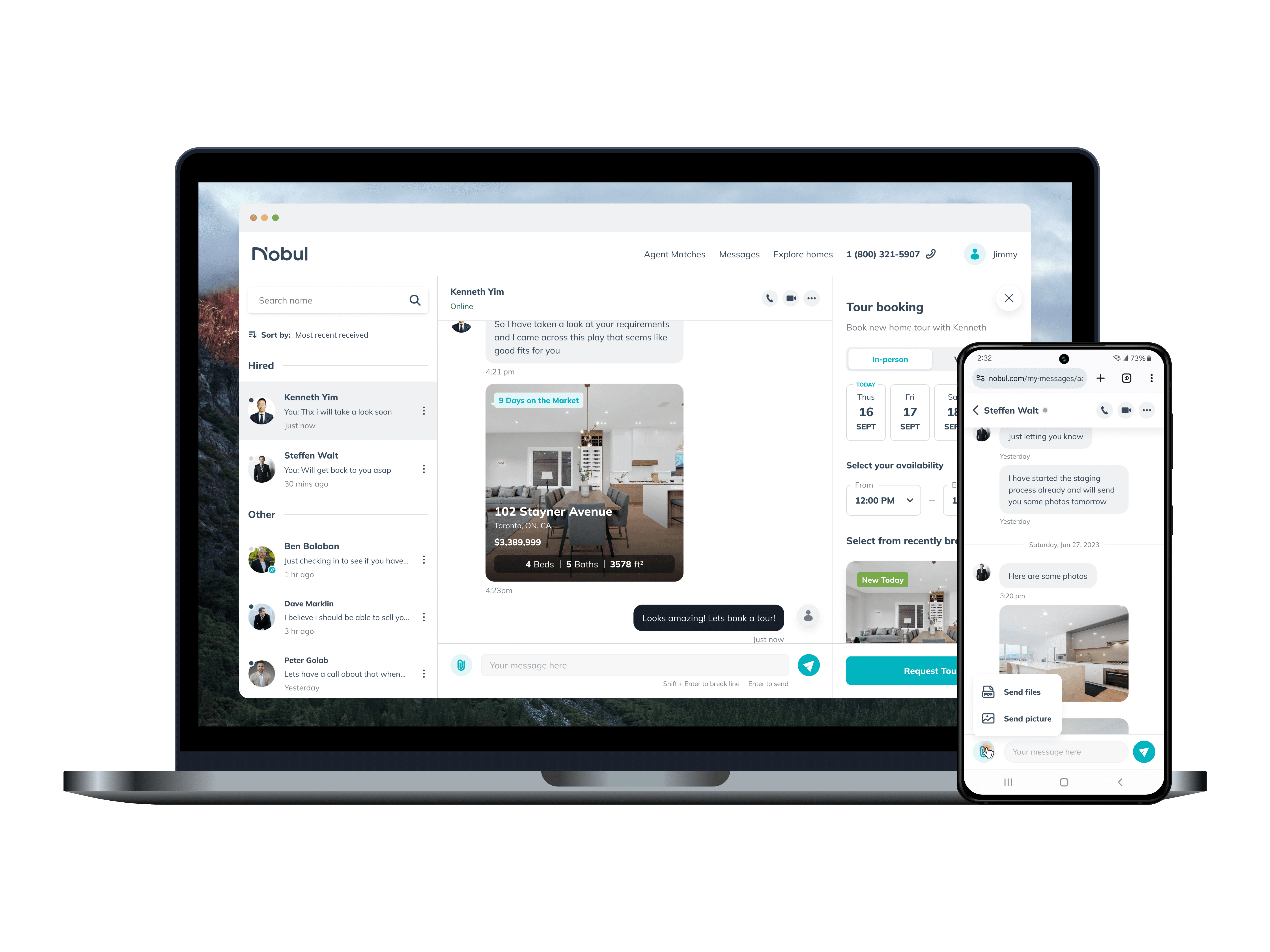
New listing flow in action
Post implementation design validation
After the new property listing workflow went live on our beta testing server, I conducted a final round of A/B testing with some of my co-workers.
Participants were tasked with listing a property with detailed information using both the old and new processes on separate occasions. We documented the average task completion speed and any feedback provided during the process for comparison. The results were impressive.

Avg. property listing time
-5 mins / 3X faster
From 7 mins to 2 mins
Users were able to list a new property with good amount of detail information about 3X faster with the new 3-step process.
Redesign the property detail page
The aim of redesigning the property detail page is to facilitate users in quickly reviewing a property's details, thereby reducing the time needed to decide whether to contact the landlord to rent the place or explore other options.

Begin with competitor research
To improve the existing design, I sought inspiration by examining how other major players, such as 51.ca in Toronto and 58.com in mainland China, were designing their property detail pages.


Audit the usability of the Old property detail page
After reviewing the designs of other major players in the market, I compared our old listing detail page to theirs and compiled a list of items where we can make improvements.
Photo preview area not big enough
The preview area should be enlarged to enable users to browse the listing photos without the need to constantly tap on the area to view in fullscreen mode.
Placing landlord contact information in the initial scroll wasted visual space
Users can conveniently tap on bottom shortcut buttons to contact the post maker, so the top space should display more important information instead.
General address info was too low on the page
With address being such a key factor in determining the likelihood of taking a rental, it should be moved to a much higher position on the page.
Reading the detailed description section for more information felt tiresome
The section could become either excessively wordy or uninformative if landlords provide minimal details in their listings. It should be optimized for users to quickly grasp property details with just a glance.

The method used to display the listing photo was lazy and not user-friendly
There was no limit on the number of photos displayed here, causing the list to become overly long. Users would have to scroll through 10+ pictures before reaching any content below.
The location map often didn't function properly and occupied an unnecessary amount of space
Many users we spoke to mentioned they avoid providing detailed addresses to prevent potential harassment. In such cases, a map like this becomes obsolete.
The listing recommendation lacked essential details such as photos, rent prices, or any other useful information.
Looking at this section as a user is a waste of time.
The contact methods displayed in the contact shortcut were not dynamic
Even if the landlord didn't provide an email address, the option to contact them via email was still present. Clicking on it resulted in an error message, which was unfriendly and confusing.

The experience of the enlarged photo viewing mode was also very unfriendly
The lack of a close/back button to exit this mode forced users to rely on phone navigation to return to the property detail page.
Additionally, the page lacked small photo previews, which could have allowed users to navigate between photos more quickly.
Creating the high-level information hierarchy for the new detail page
Based on the designs of other major players in the market, I reorganized the information hierarchy for the various sections on our current page. Additionally, I introduced some new sections to address the issues identified during the audit I conducted earlier.

The newly revamped listing detail
I progressed through the hi-fi design, refining one section at a time. I continuously optimized the design based on feedback from other designers and stakeholders in the company.
After nearly two weeks of iterating through various versions with minor differences, I settled on a final version of the page. I believe this version achieves the goal of being a more informative page with a modern, clean design that enables users to glance through property information more quickly than before.
Design validation
Just as I did when redesigning the property listing flow, I conducted a brief round of validation tests with 5 of my co-workers who actively search for rental options on VanPeople to determine if the newly designed page will achieve the intended goal.
Avg. decision making time
-23 sec / 73% faster
From ~50 seconds to ~28 seconds
When comparing the speed of decision-making between the new and old designs, participants were able to decide whether to contact the landlord much quicker when viewing the same property on the newly designed property detail page.
Enhancing the informativeness and monetization potential of users' initial scroll
Photo preview area got BIGGER
The section now utilizes a much larger screen real estate to display the property photos in a more visually appealing fashion.
The rent price and property address have been moved up
Users can now easily see both rent prices and property addresses at the top of the page. Additionally, the design has been refined to make information presentation more visually intuitive.
A new ad banner spot was added
Over 85% of people scroll to the detailed description section of the page. We saw this as an opportunity to capitalize on the traffic/views by adding a new ad banner before the detailed description.

All key info at a quick glance
A new basic rental info section
This section provides users with a concise yet comprehensive overview of the property. It includes details such as the property type, rental type, availability date, number of bedrooms/bathrooms, and any pet-related limitations.
Added a new amenities and a. new tenant limitation section with custom crafted icons
These two new sections now provide users with a comprehensive description of all the amenities included with the property rental, as well as any preferences or limitations set by landlords regarding the type of tenant. Intuitively designed icons have been added to the design so users can understand the items even without reading them.

A more intuitive enlarged photo-viewing experience
Added a proper close/back button at the top right of the screen and also added a scrollable small photo preview section at the bottom of the screen.
Added a "load more" button so users can view more listing photos when they feel like it
Users are no longer forced to scroll past 10+ photos each time they want to view content located at the bottom of the detail page.

Enhancing the informativeness and monetization potential of users' initial scroll
Photo preview area got BIGGER
The section now utilizes a much larger screen real estate to display the property photos in a more visually appealing fashion.
The rent price and property address have been moved up
Users can now easily see both rent prices and property addresses at the top of the page. Additionally, the design has been refined to make information presentation more visually intuitive.
A new ad banner spot was added
Over 85% of people scroll to the detailed description section of the page. We saw this as an opportunity to capitalize on the traffic/views by adding a new ad banner before the detailed description.

A renewed shortcut bar
The newly designed contact method shortcut bar will dynamically presents available contact options appearance based on the different types of contact methods added. Users will no longer get error messages when interacting with this new version.

New property detail page in action
Notable improvement in overall listing quality after implementing stage one
Two months after implementing the new property listing flow and the updated property detail page, we've observed a positive trend: there's been an uptick in the average number of rental listings posted daily on the platform. Notably, many of these listings now included substantially more of detailed information.
% of listing with photos and a clear rental price
Increased by
+200%
From around 3 in 10 to 9 in 10
Avg. number of rental listing posted daily on platform
Increased by
+22%
From around 110 to around 135


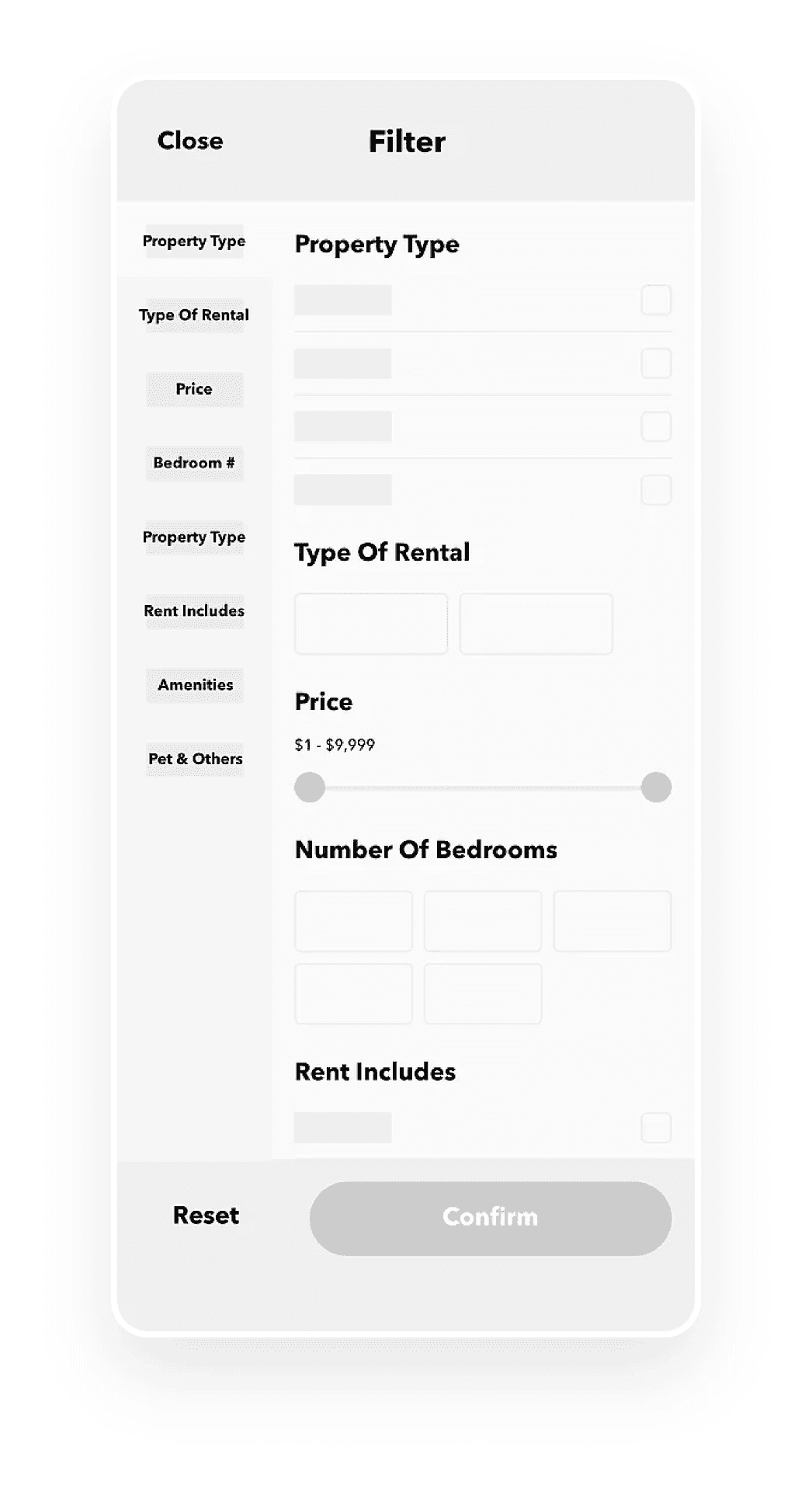
Introducing a new search result filter
The primary objective of designing a search result filter was to create a tool that enables users to efficiently narrow down rental search results based on their personal preferences, reducing the time spent scrolling through property listings.

Researching the needs and expectations of our users
We conducted a brief round of user research with 7 colleagues who have rented homes in the last 6 months, documenting their key considerations when searching for a rental property.
Given our urgency to implement a filter function, after discussing the matter with the company founder, we agreed that the design of the initial version should not be overly complex and should be tailored to the needs of our Chinese target audience.

Defining whats essential
After having gathered a round of input from the colleagues I talked to earlier, I moved onto coming up with an essential list of categories to be included for the MVP version of the filter.


Gather inspiration
Before embarking on design ideation, I gathered inspiration and insights by studying rental filter designs used by other major platforms. Subsequently, I expanded my research to include designs from non-rental-related platforms as well.

Finalizing filter requirements
Before proceeding with the design phase, I compiled a list of specific product design requirements for each section of our filter. This was achieved by cross-referencing the findings from our market research with the feedback obtained from the user interviews conducted earlier.
房屋类型
Need to have a filter to narrow down results
Condo, House, Townhouse and Back Alley Units.
租金包括
Display what else do the rent include
Water, electricity, internet, and natural gas (not heat).
卧室数量
Number of bedrooms
Use a “more or equal to” [1+,2+,3+ etc...] system so that users can always browse around to see if there are additional options with more rooms within the same price range.
出租类型
Display what type of rental it is
One room only vs full suite.
设备设施
Amenities
We narrow the options down to in-suite laundry, independent kitchen, basic electronics, basic furniture, central air conditioning, independent washroom, independent parking slot, and EV charging.
其他条件
Pets & Other
You can choose to view units that allow for cats, and dogs. You can also choose to view rental units that do not have gender preferences. At last, you can view rentals with pictures only.
A/B testing between two variations
By applying the general design patterns gathered from the inspiration-gathering process and integrating the list of design requirements generated earlier, I have developed two design variations.
To determine which variation would be selected in the end, I conducted an A/B test with five of my co-workers. I asked them to perform specific tasks, recording the average amount of time it took them to complete these tasks for each variation.
Variation #1
Opted for a straightforward layout that provides users with a top-down view of all the items they can use to filter the search results.
However, a potential issue with this version is that as the list of filter options grows longer in the future, users may overlook many useful choices. This concern became more apparent when the same design was tested with additional filter options planned for our second-hand car buy-sell service later on.

Variation #2
Changed the price filter to a slider design to allow users to set a general price range more quickly than manually entering all the numbers.
Utilized various button designs such as checkboxes and radio buttons to differentiate between multi-selectable options and single-select options.
Implemented a side navigation bar, leveraging the box-like shape of Chinese characters. This enabled us to display the section titles in the navigation bar with a large font size for improved readability.
Avg. task completion time
v2 was 26% faster than v1
14 seconds vs 19 seconds
The overall usability of variation #2 surpassed that of variation #1. Participants took an average of 19 seconds to complete the task in V1, whereas V2 had an average of 14 seconds.
Introducing search by map
This entire feature was designed end-to-end by Ginny Wang, the other product designer who was on my team. I worked closely with her as product manager to ensure that the feature was going to provide the best possible user experience for our users in the end.

Researching the core user needs of a property map-searching tool
Ginny conducted a round of user research and organized a short list of items that represented the core user needs for using such a tool.
Need to have a filter to narrow down results
Should include the same property filter.
Search for properties near skytrain
Should provide a way to only show properties near skytrain stations
Search for homes near specific school
Should provide a way to only show properties near elementary schools, collages, and universities
Have a lag-free interaction experience
Cannot constantly have freezes when users are scrolling across the map
Create clarity from ambiguity
She then created a high-level information architectural chart with the data she gathered from the research phase.

Gather inspiration
She also gathered design inspiration by studying similar features used by other major platforms.

Experimenting with different layouts
At first, we decided on a more traditional layout. Many similar products we came across had the search bar located at the top and an area of control at the bottom.


We layout we agreed on in the end
Due to the search function's inability to locate listings by address, we initially made it less prominent while planning improvements.
Fortunately, after redesigning, feedback was positive, especially for the version featuring a fullscreen map presentation. Users appreciated the cleaner design and increased space for listing display. Despite reduced visual space, all controls remained noticeable, enhancing user experience.

Final high fidelity design
After close to a month on crafting the design, we have finally arrived at a visually appealing, and immersive property browsing experience. After launching the feature in late 2021, the feature is now becoming more popular as each day goes by.
Notable improvement in key metrics after implementing stage two
Within just a month of introducing new search result refinement options, we observed a significant increase in daily visitor count and overall user satisfaction.
Daily visitor count of VanPeople home rental
Increased by
+21%
From around 12k to ~14.5k
% of user who would recommend us to others
Improved by
+34%
From 66% to 89%


Creating a more effective channel to collect feedbacks
Upon observing a clear improvement in the platform's user metrics after implementing stage two features for public beta testing, I decided to run a WeChat account on the side to offer customer service support. This initiative aimed to foster closer connections with our users.
The feedback I collected while operating this WeChat account indicated that many users regained trust in our platform's ability to provide high-quality rental options.


Revamp the property listing page
According to the execution plan set at the beginning of this project, upon completing the previous stages, the next step was to further enhance the listing browsing experience to enable users to extract information more efficiently.

Audit the usability of the old property list page
During the audit, the most notable issue I found was the low efficiency in information extraction due to the ineffective presentation of meaningful content.
Users had to invest considerable effort in reading through lengthy two-line titles carefully to extract useful information to decide whether to click on the listing or not.
Furthermore, displaying the listing creation date on the bottom right was another piece of redundant information occupying valuable screen real estate. Since everything was displayed chronologically, users could simply refresh the page to see the latest rental options.

Gather inspiration on property cards design
During competitor research to gather inspiration for property card design, I discovered several common trends among other players in the industry:

Property info tags/labels
Most companies would use small tags or labels to display essential details about each listing in a concise format. This includes key information such as property type, price, location, number of bedrooms/bathrooms, and any standout features or amenities.
Auto-generated listing titles
Most companies would use short auto-generated listings titles that are short and informative.
Various format in display location info
For companies in China, the location information tend to be way more specific since the users would input their location information really differently than the platform in the west.
Revamp how we present our property info
Thanks to the enhanced property listing flow, our listings now contain significantly more information than before. With this wealth of data available, I believed it was the perfect opportunity to introduce a label system. This system would complement the user-generated titles by selectively displaying additional rental information. The goal was to assist users in quickly extracting key details when browsing through the listings.
With that objective in mind, I proceeded to draft variations of layouts for presenting property information. I ended up with a grid and a list layout catering to the browsing needs of different users.


Given the constrained horizontal space in both layouts, we needed to be strategic about which details to prioritize in the label system. To inform our decision, I revisited the user feedback collected during our interview sessions.
From this data, I developed a logic chart outlining how information would be displayed through the label system ensuring that only the most essential details related to a user's home rental decision-making process would be featured.

Arriving at version #1 after considerable exploration
During design exploration, I found that using colors on the labels could easily clutter the browsing experience. Therefore, after experimenting with various approaches, I decided to adopt a design that is easier on the eyes.

Initial usability test with live data did not go well
When we ran a usability test on version #1, we came to realize that the new version's one-line title was not able to fully display the lengthy titles that our users creating.

Exploring different ways to optimize the design
First solution, just give the 2 lines back to all the titles
The initial approach I considered was simply giving back the two lines of display space to all the titles.
However, this approach presented two issues. Firstly, it resulted in uneven spacing between listings, as some titles were shorter and occupied only a single line. Secondly, it didn't address the underlying issue of many titles being unnecessarily long in the first place.

A "more creative" solution - Automatically generate shorter format titles
Given that many rental platforms employed auto-generated listing titles, I considered adopting a similar approach.
Since our users' titles often conveyed similar information to what the new property label system provided, I proposed merging the content of these labels to form the new titles for all listings. This feature aimed to streamline the browsing experience and save time for users listing properties. However, when we tested this design with live data, it received significant criticism.

Listings became indistinguishable
When we conducted an A/B test on this new version using live data, although the overall UI appeared cleaner, we received numerous complaints.
Users felt that the auto-generated titles removed visual cues that previously helped them distinguish listings from each other. Subsequent internal usability testing confirmed this issue. The lack of distinctive titles led users to click into more posts because they could no longer make informed decisions by simply looking at the property cards on the listing page.

It seems that the simplest solution often turns out to be the best one
So after having interviewed 7 users who have posted a property for rental recently, I came to realize that the best solution is actually simple; all I had to do was just reduce the word count limit for the title by half, and our users would automatically find more creative ways themselves to write unique looking titles that are shorter and more precise.

Final version for release
After about 3 and a half months of design, refiment, and development, we have finally released a refreshed property listing page that allowed users to make home rental decisions faster than before.


Following the release, we received a range of positive feedback directly from our users
While I was unable to gather numerical evidence indicating a significant improvement in decision-making speed, we did receive positive feedback from many users after launching the newly designed property listing page.
They reported that browsing for properties with the new design was much easier and required less effort compared to before.

Improving monetization capability
With all the planned tasks from the previous three stages now completed, VanPeople's home rental section has experienced a notable uptick in daily visitor counts and overall user satisfaction. Given these encouraging results, I believe it's time to explore additional opportunities to capitalize on the increasing traffic of VanPeople's mobile home rental section.

Two fold approach
After consulting with stakeholders across the company, I've identified two key objectives to enhance our monetization capabilities.
Firstly, we aim to bolster our business-facing monetization by introducing new advertising solutions that leverage the traffic on the property listing feed.
Secondly, we're looking to broaden our platform's revenue streams by implementing strategies to capture potential earnings from non-advertising clients.
Business Client's Needs - More advertising opportunities
Given that the bulk of our revenue stemmed from sponsored business ads, the sales team and I opted for a straightforward solution which was to add a dedicated advertisement section to the top of the property listing page.


Non-advertising clients' needs - Buy more listing exposure
Ever since I began operating the WeChat customer service account to enhance our feedback collection efficiency, one of the most frequent requests I've encountered is users asking if they can buy additional exposure for their rental property listings by paying us a small fee.
In response to user requests, we've introduced a new service allowing them to display rental ads multiple times across the listing feed for increased visibility. These ads, more affordable than business ads, appear directly after business ads at the top of the page, ensuring accelerated exposure.

How to introduce the new exposure acceleration service
The primary challenge I encountered was promoting our new service to users effectively without causing annoyance. After thoughtful consideration, I identified the opportune moment for promotion: right after users complete the listing of a rental property.
The objective was to introduce the exposure acceleration service as a friendly, helpful tip to enhance the effectiveness of their rental ads with a small fee.
The slide-up modal design was chosen to prevent users from closing it until they made a decision between availing the services or declining them. This approach ensures that users must actively engage with the offer before proceeding to the completion screen.
Importantly, regardless of whether the user closes the window or not, the property would have already been listed by this point. This design balances promotional exposure with user experience, fostering a seamless interaction while maximizing promotional reach.
An intuitive checkout process
To streamline the checkout process, I drafted up a payment flow that would enable users to potentially complete payment in as few as two steps.

After extensive discussions with our users online, I've pinpointed four crucial design criteria to effectively market our new accelerated exposure service to our users.
Firstly
User should have control over the exposure to promotional material
To ensure maximum exposure to potential customers, we devised a strategy to display a service introduction slide-up card to users who complete listing a property for rent, at least once.
However, we recognized that interrupting the user experience could be intrusive. To address this concern, we implemented an option for users to opt-out of seeing this promotional ad for 7 days.

Secondly
The material presented should be short and easy to digest
To mitigate user frustration associated with scrolling through lengthy pages to grasp new service details and benefits, I employed a design strategy featuring succinct explanatory text and straightforward illustrations placed adjacently.
This approach enhances user experience by simplifying information consumption and improving comprehension.

Thirdly
The pricing should have high transparency so people know exactly what are they paying for
To alleviate user concerns regarding hidden fees, I prioritized providing a transparent breakdown of the payment amount.
Initially, I explored consolidating the service selection and payment pages to streamline the process. However, recognizing that some users may not be tech-savvy, I opted for a more reassuring approach. By displaying comprehensive payment details alongside service reminders, users can confidently review the total cost before proceeding. It's crucial to highlight any additional charges, such as the 3% service fee and taxes, ensuring users are fully informed before making a payment commitment.

Lastly
User should know exactly on how long the service will last and how to renew it if needed
The post-purchase experience is also fairly important as it will help the platform

Payment flow in action
Project overall impact & result
Towards the end of May 2022, I conducted a comprehensive analysis by documenting the average daily visitor count and daily property posted between January to Jun 2022. I then compared the six-month average of both of these two factors to the same period in 2020 and 2021.
Data was synthesized using a combination of Google Analytics data and insights gathered from our internal native app metric monitoring tools.
Daily visitor count of VanPeople home rental
Compared to 2020
+19%
From 10.5k to 12.5k
Compared to 2021
+30%
From 9.6k to 12.5k

The number of unique daily visits to VanPeople's home rental increased drastically indicating that more users were using VanPeople to post or search for rental properties on mobile devices.
Average amount of listings posted daily
Compared to 2020
+12%
From 122 to 137
Compared to 2021
+20%
From 114 to 137

The average number of properties listed on VanPeople's home rental platform each day experienced a significant increase after the completion of the project.
Project impact over company revenue
Since my departure from the company in early June 2022, I haven't had the opportunity to personally observe the long-term impact of the new monetization model on the company's revenue. However, the product manager who succeeded me was kind enough to share some data nine months after my departure.
Monthly revenue from home rental
+80%
Went from ~8,000 CAD to ~14,000 CAD
Considering that the monetization changes were deployed across all platforms including desktop, mobile web, and native app, the impact of the new monetization methods was assessed by measuring the total monthly revenue generated by the home rental section across all platforms.
Passive income from non-business user
+400%
Went from ~500 CAD to ~2,000 CAD
The project effectively shifted VanPeople's business model from solely targeting businesses to also targeting platform users. Revenue generated from selling ad exposure acceleration services to users of the home rental section surged to 2,000 CAD/month within three quarters. Notably, this new income source didn't incur commission cuts as it bypassed sales personnel.
At the time of measurement, the revenue generated from selling this service to users across the entire classified listing platform was estimated to be around 15,000 CAD per month.